Having finished to 960px website, I am now creating the 320px version.
I have a conventional horizontal menu in the 960 site, with a transparent background
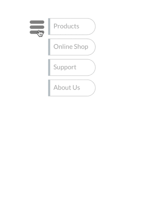
I have a hamburger menu in the 320 site, which has a grey background.
However it would appear that when I switch on the grey background for the hamburger menu, it also appears in the horizontal menu in the 960 site.
I thought it was supposed to be one menu per device. What am I doing wrong?
Yes it does state that, but not all things are carried across to the different device sizes. It is confusing the way it is. I hope Duncan can improve on this going forward.
The only way at the moment would be to have a new menu for the 320 device and and use the ‘show on this device’ so that you only have one menu displaying at any one time etc.
Can you explain how I can hide the menu in the 320, and then reintroduce it please? Because once you hide it, the menu elements in the right hand part of the screen disappear!
Its stage 4 I’m struggling with. Once I hide on the 320, the menu element disappears, along with the selection of menus available (horizontal/ vertical/ hamburger)
At least that is what happened when I tried doing this yesterday (per @FlaminFig 's advice)
I’m probably missing something simple, or just being simple…
Thanks again for your help
Sorry you’re still having an issue. I’m not by a computer until I get into my studio tomorrow.
What you need `to do at stage 4 is to go to the ‘insert’ drop down menu in the main Sparkle menu bar and click the ‘menu’ item in the drop down list. This will insert a brand new menu for the 320 device. When you have it on the page then you will be able to choose the mobile hamburger type.
I’m so sorry, but I don’t think I explained it very well. If I had a computer at home, I could show you a screen grab, which would be easier to understand etc.
@rimram Thanks Scott - that sorted it. @FlaminFig Should have listened to you first time! @duncan Duncan, this issue would benefit from being clearer in the documentation
@vk2003
I’m glad to hear you found a solution …
Yes, I agree, this needs to be clearer in the current documentation and hopefully this will be improved in a future update.
As it is now, it seems the menu for different devices is too confusing and I have struggled with it myself.