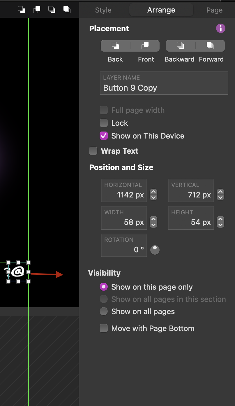
I just recently bought Sparkle Pro, and was wondering if there was a way to move objects outside the left/right margins? As you can see in the attached image, there is a green line showing I can’t move any objects beyond it, with the red arrow being where I’d like to move the objects. The same issue with the hamburger menu on the top left of my pages.
So now when I preview my website, everything looks kind of awkward as these objects are a bit too far from the edge of the screen as I’d like, which is killing my OCD.
Unfortunately for now we are unable to move elements beyond the set page/device width.
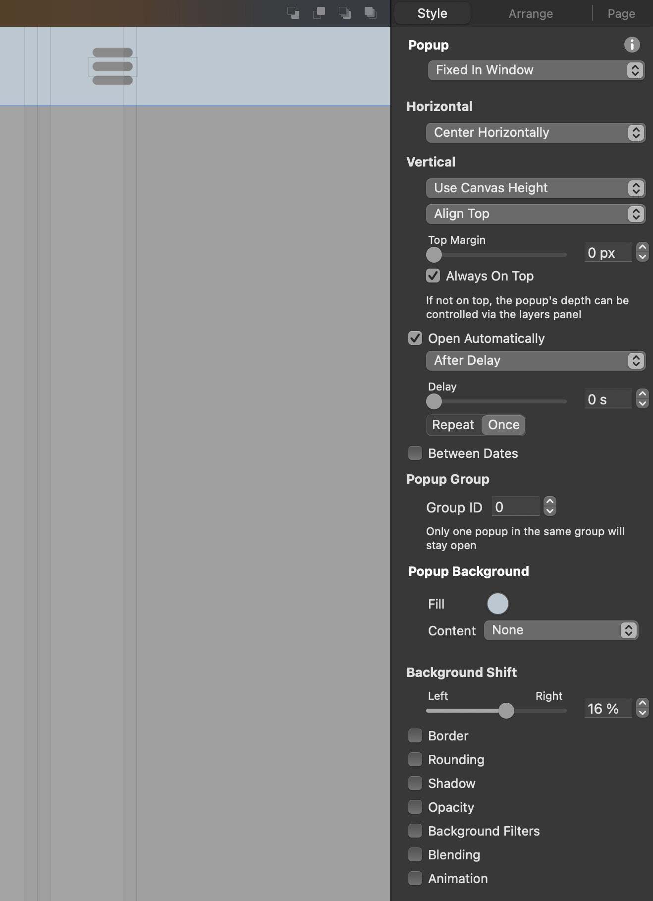
But with a slight workaround and using a Popup you could get something like what you are after.
Although the hamburger is still within the confines on the canvas, in the browser it is beyond the page canvas confines.
The magic is the “Background Shift”.
Just follow the sittings of the screenshot…
I’m not sure if a pop up will achieve what I’m trying to do. I forgot to mention I’m custom editing only the “Desktop PCs” and the “Portrait smartphones” layouts on my 14" MBP, while leaving all the other layouts on “Automatically Scaled”.
So now the hamburger is sitting perfectly where I want in the corner of the screen on the “Portrait smartphones” mode, but on desktop mode , it’s physically sitting about 5cm away from the bezel on my screen, which looks odd to me. And at the bottom right corner on the image is a ‘@’ button/link to the ‘About’ page, which is why I’m not sure a pop-up will work.
Is there no other way to ‘unlock’ the margins, or add such feature to an update? This is kind of a deal breaker for me. I tried the Sparkle trial version first, but wasn’t able to properly tell how far these objects were sitting away from the corners as there was still the “Sparkle Trial Version” banner that took up the top part of the screens…
@mrgreen, for now there is no way of moving elements beyond the set page width unless you are using the Widebox, Image Gallery, Embed, Map, Video, and Popups.
But in saying that the Sparkle Team is aware we would love to have something like that and I’m sure it is on their to-do-list.
So have you come from a system where they use a responsive liquid layout approach?
Sparkle uses the responsive fixed-width protocol. It is another way of creating websites and for me it is very predictable and reliable. Half the time the responsive liquid layout protocol is a fair bit of guess work as you cannot test for every device that views the website.
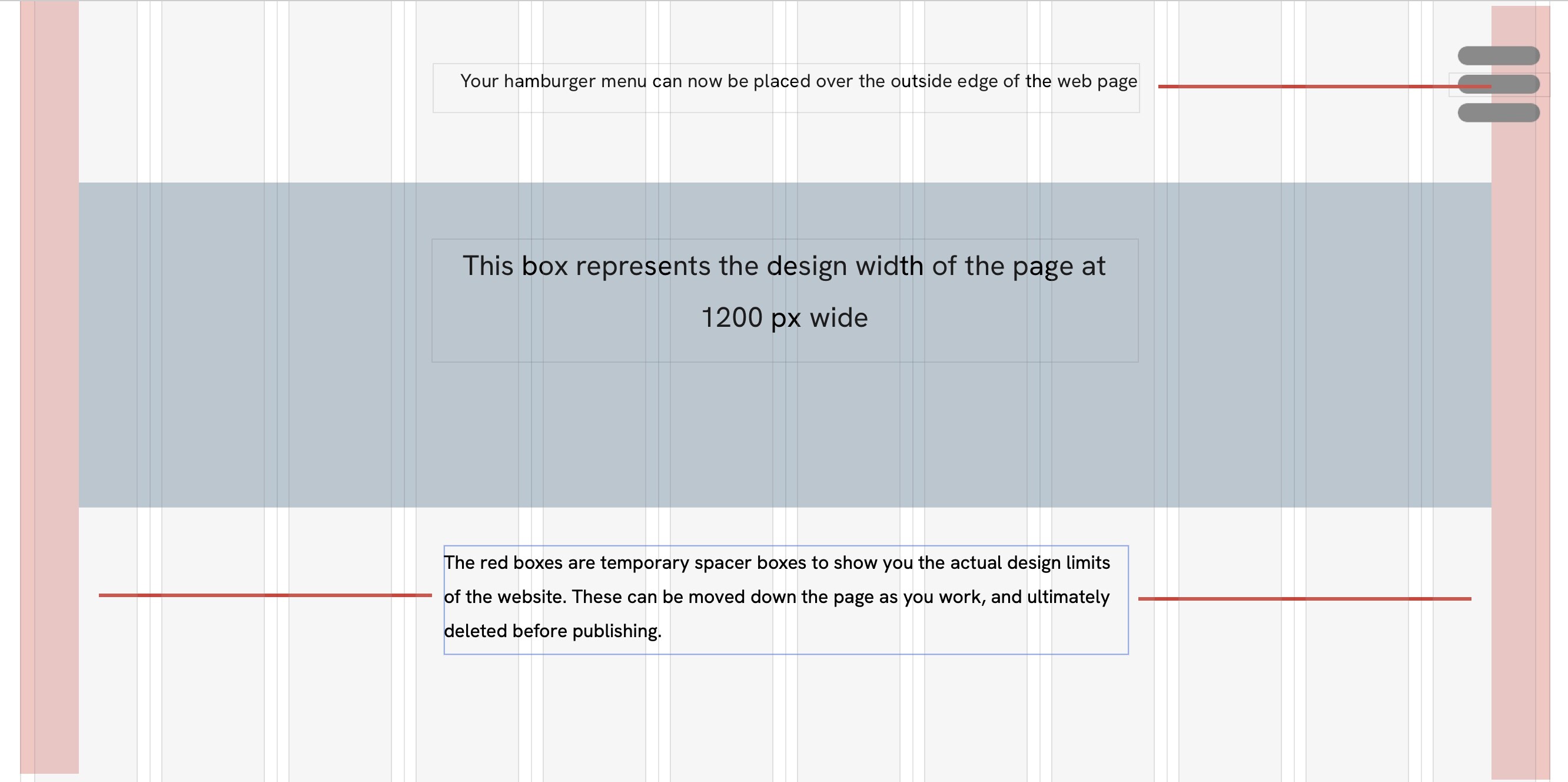
If you look at the Sparkle App website (https://sparkleapp.com) you will notice that certain elements are pushed to the browsers edge. With a little bit of knowhow Sparkle can be pushed to do magical things…
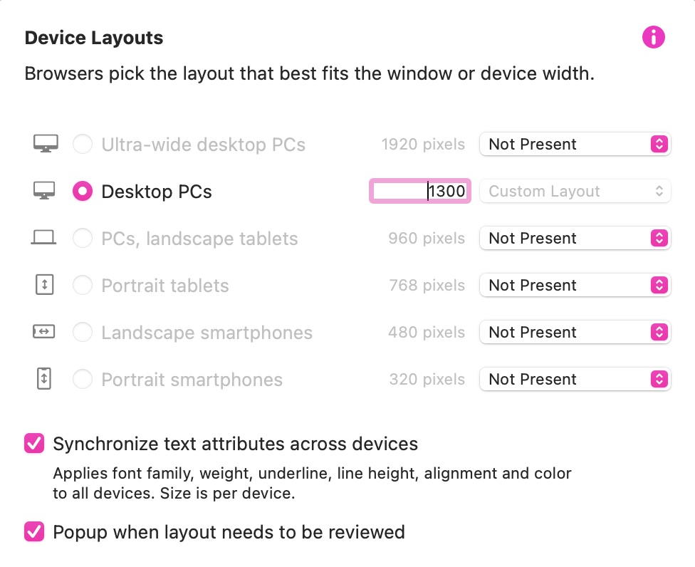
The easiest solution is to increase your desktop page width to say 1300, instead of 1200. Of course, it will all depend on your design as to how this looks on the final website. Essentially, you continue designing your page as if it were 1200 px wide, but placing some elements within the extra space you’ve given yourself on each side of the page.
Yes!! Thank you so much for this it works perfectly I set it at 1400 and now everything’s sitting nicely in their corners. Does this affect how other laptop/desktop screens see it? As in , would a 16 or 12 inch MacBook see everything in the same proportions, as I see in my 14 inch? Thanks again
it does affect everything, as Sparkle design its not auto responsive. So in a screen with resolution lower than 1400, it will have horizontal sliders.
The margin limits are actually to avoid you making this kind of “mistake”. The popup solution would be the best one, since it behaves exactly the same everywhere.
With screens getting bigger and bigger horizontally, the centralized method of design is getting more popular (or getting back to actually) and it is considered a good practice of web design.
A valid point, but if that were to be a major concern, the simple answer would be to use the standard 1200px width and shave off 20 - 50px on each side of the screen to create a new design width of between 1100px or 1160px.
When we design a website we are not designing it for one screen size.
The popups are the closest thing to making it work as it keeps it within the functioning of the Sparkle design platform and consistent across devices out in the wild.
They are pushing bigger and bigger screens! A website can only do so much stretching until it just looks outright ugly, hard to read, and feels like you have to step back 5m to take it all in!
Although I generally concur with other opinions in this thread, designing a website with a width of 1400 pixels should generally fit well within the screens of most laptops without causing horizontal scroll bars. According to recent statistics, the most common laptop screen resolutions range from 1366x768 to 1920x1080 pixels. A 1440px width should accommodate these resolutions comfortably. However, to be absolutely safe, I wouldn’t normally recommend designing a web page to a CSS width of no more than 1280. In fact, it’s been many years since I saw a laptop that couldn’t handle this width. This is why there is an almost industry standard of 1200. At this size you leave plenty of room for that stuff we call ‘browser chrome’. The real litmus test is to try it on as many devices as you can lay your hands on.
 I set it at 1400 and now everything’s sitting nicely in their corners. Does this affect how other laptop/desktop screens see it? As in , would a 16 or 12 inch MacBook see everything in the same proportions, as I see in my 14 inch? Thanks again