Hi,
I can modify the navigation menu on my site in desktop layout. When I want to adapt it to smartphone layout, I cant change it. I can reduce the font size, space between elements, but the whole menu does not appear, even if I click on the eye button (It’s horizontal mode).
Thanks
Patrick
There could be a number of reasons for this, so lets start with the basics and see if we can get it working for you.
Firstly, in your desktop layout select the menu item on the page and check in the layers inspector to see where the menu is positioned. In almost every instance, your menu item should be at the TOP of the layers list. If your menu is part of a group of object, make sure that the group is at the TOP of the layers list AND that the menu item is the FIRST item in the group - you can select the menu item and drag it up the list to reposition it. Here is an example:
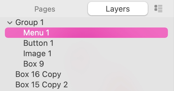
This will ensure that your menu sits ABOVE everything else on the page and won’t be obscured by any other elements. Also check the Arrange inspector on the right of the interface. Make sure that the option to show on this device is checked.
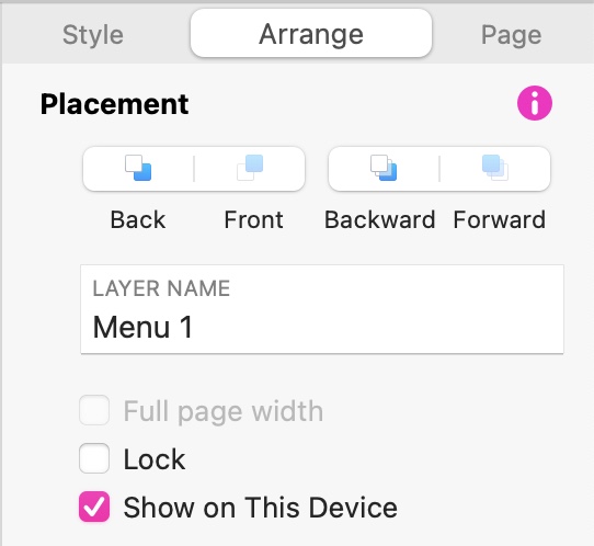
Now switch to your mobile layout. If you don’t see the menu on the page, again, check the Arrange tab to make sure the ‘show on this device’ option is checked.
If you go to the layers inspector, select the menu item from there and see where the menu is on the page - it will be highlighted with resize handles to make it easier to find. Scroll around the page to see if the menu has been inadvertently positioned somewhere else on the page. If it has, just move it to the correct position.
On a mobile device, its often better to use the COMPACT menu option, shown here:
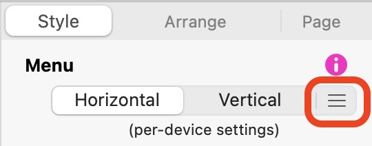
This will convert the menu on the mobile layout into a ‘hamburger menu’ which you can position at the top of your page. Selecting the icon will allow you to style the menu specifically for mobile use. Any changes you make on the mobile page will not affect the styling of the menu on the desktop page - they are independent of each other.
If this doesn’t solve your issue, please provide more information about the settings you’ve applied to your desktop and mobile menu.