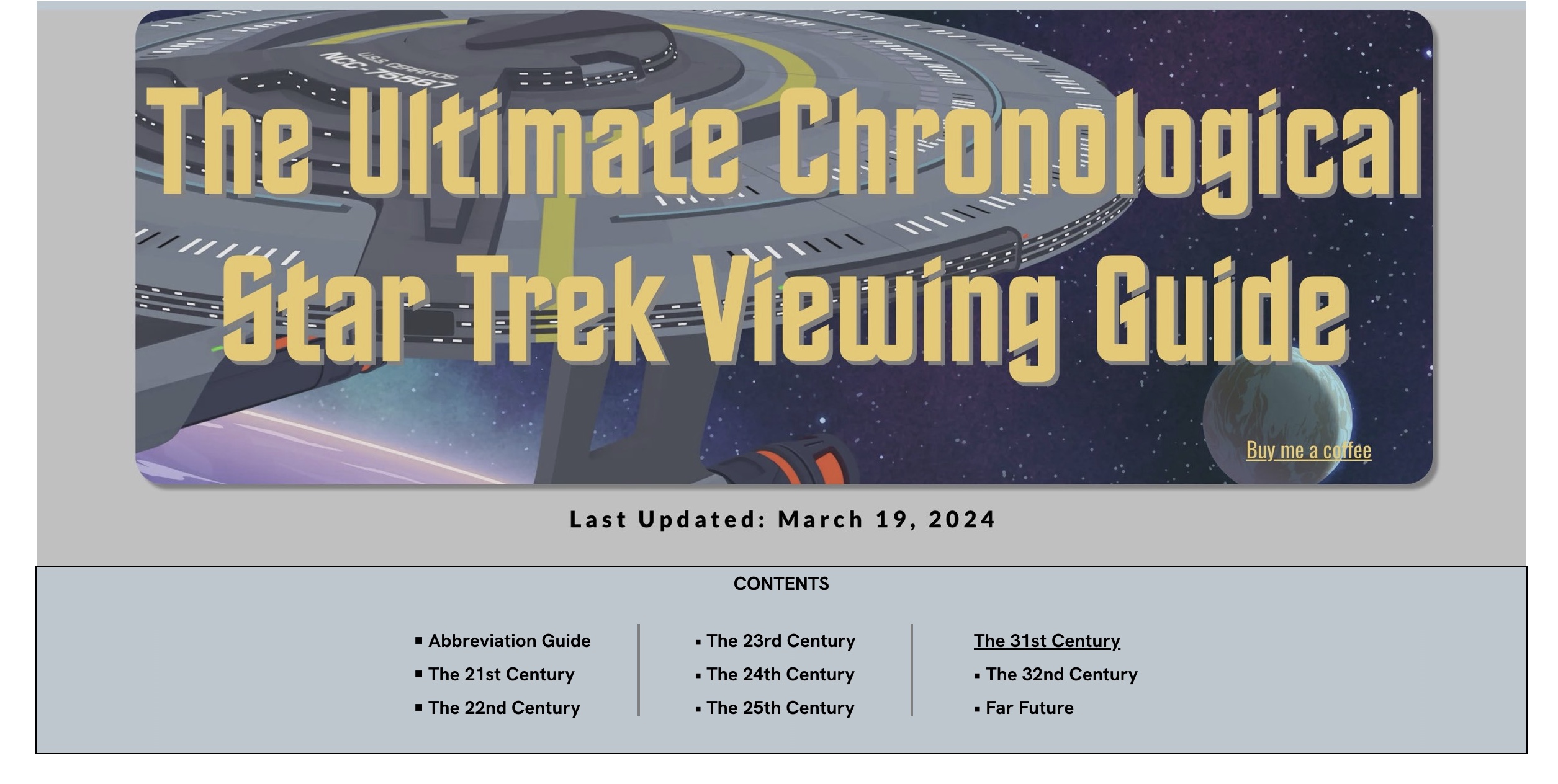
I have more tweaks planned for this redesign, but it was good enough to put it live tonight ![]()
2 Likes
Wow the content! ![]()
![]()
![]()
Myself calling as a huge Trekki fan … what a fabulous website, all the timelines and the dates, wow how much time is behind your website, is just mind blowing.
Congrats and the all the beautiful selected background photos, i love it.
I am so dedicated that I am also playing Star Trek Fleet Command ![]()
Live long and in prosper !
Michael (no not that Michael lol)
2 Likes
Exactly… Huge amount of work.
Now, for the time to work (back) through all the episodes/movies in sequence ![]()
That seems like a real labour of love, but it is a lot of scrolling for users. If you’re going to do some tweaking, maybe you would like to consider these suggestions.
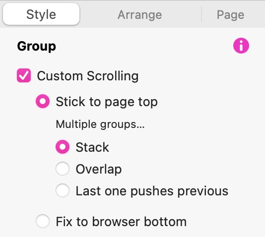
Instead of having the contents box over on the left of the screen, maybe it would be better set up as a horizontal box, as shown in this screenshot.
By doing this you can group all the elements that make up the contents block (background box, text links and heading). Once grouped, you can set the group to stick to the page top over in the style inspector. The option looks like this:
Go through the rest of your page and select all the elements for ONE century only. With all the items selected, right-click and select Move to Layout Block from the context menu. Repeat this for all the other ‘centuries’ on the page. When you place a layout block, it will initially fill with a standard wire-frame colour to show you that the layout block is there. You can change or remove the colour over in the style inspector. Create layout blocks for the ‘Abbreviation Guide’ and the ‘Far Future’ sections of the page. Set ALL the layout block to be Initially hidden:
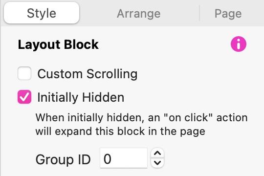
Important: Make sure all the blocks have the same Group ID,
All you have to do now is set your links to make the layout blocks visible when a link is clicked. Go to each link in turn and set the On-Click action as shown below:
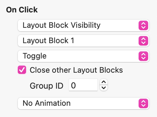
Animation is optional, but may add a nice touch.
Obviously, for each link, you will choose the relevant layout block for that link.
Now when people view the site, they will see your page header, the contents box and your page introduction. If they click a link in the contents box, the relevant part of the web page will appear. As they scroll through the information, the contents box will stop at the top of the page from where users can choose another link whenever they are ready. This is far more user friendly than scrolling through a very long page of information.
Just my take on the work you’ve done - I think it would be easy to tweak and not very complicated, but it can change the whole user experience.
3 Likes