Heya. Made a site and have 320 and 480 layouts. (And others, but focusing on phone for now). The 480 looks good on the iPhone in landscape, but the images show up in the wrong place when in portrait, despite me having a portrait phone layout. Pics included. Any thoughts?
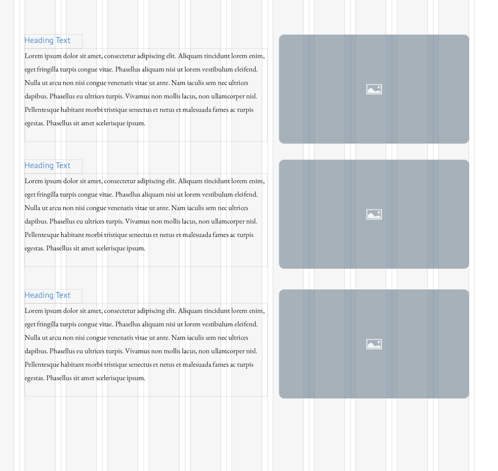
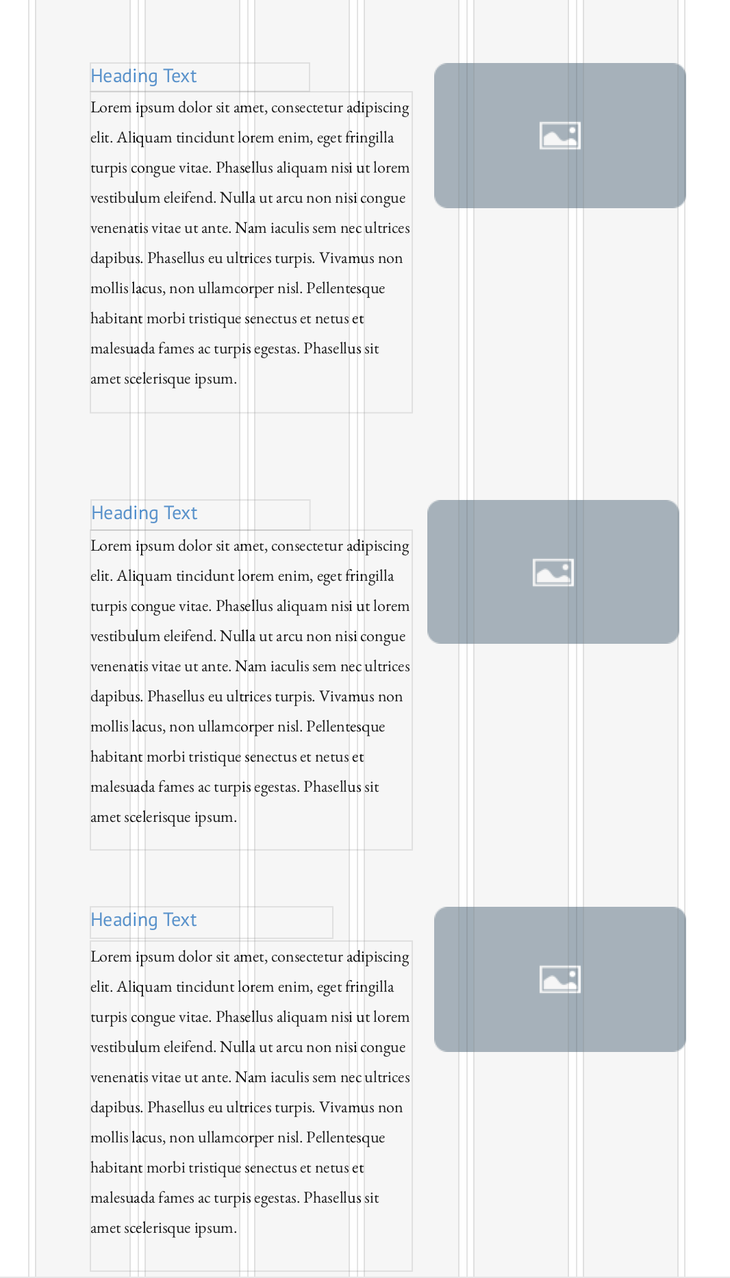
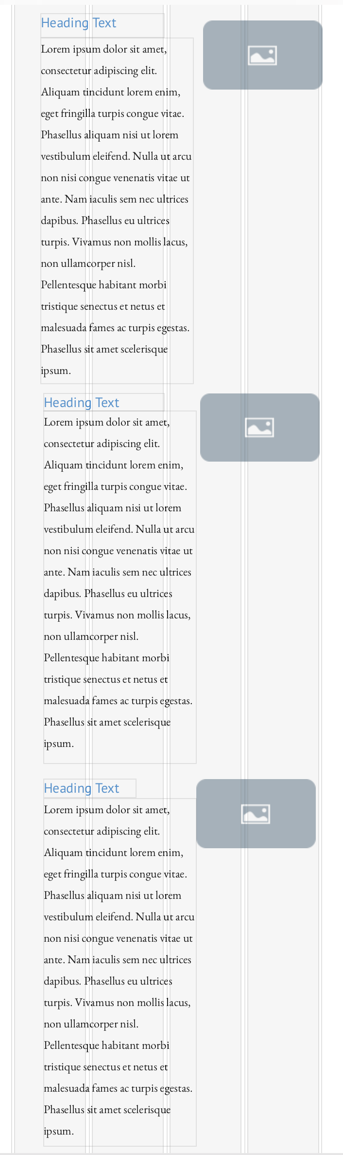
It’s hard to see from your screenshots, but this problem usually occurs where you have set your text content in one long text box and then aligned your images to the lines of text. The answer is to make each section of the page as if it was a self-contained block of information. For example. Create the heading box and then add a separate box for the list. Finally, add the images so they align with the actual text boxes rather than the lines of text. You can then switch to each of the other breakpoints and resize the text and realign the images to the appropriate text box. This will keep everything aligned at every breakpoint. Here are some examples:
1 Like
You are correct that having a long list and aligning to text lines is what I am doing. Really not looking forward to reformatting it the other way as I have so much content in there and am afraid of having to tweak a million things every time something changes… but if that’s the only fix that’s the only fix. Waiting to see if anyone else has feedback, but yours is very much appreciated, thank you.
@JDHamsterWheel, As I have suggested to many others before, when it comes to the mobile layout it has to be a 1 column job otherwise it just gets too hard to make things out.
The layout of a mobile site can either flow (making it a breeze for a client to interact with and read), or become a hurdle that frustrates. My suggestion would either have all your images start the content off or finish the content off my placing it below its content. In doing it that way you can enlarge your images to the full width of the device and not have a lightbox of it because it is never bigger than the thumbnail anyways.
Good luck! :)…
I agree with @FlaminFig. The usage statistics bear out this line of thinking. Only about 10% of smartphone users will use their device in landscape mode - many of those only do so because the app they are using forces them into landscape (such as Netflix). Best to keep the smartphone version of the website as single column. With tablets, things are a little different, Small tablets (7-8 inches) sees an increase in landscape usage with some 48% using their device in this orientation. This orientation usage increases to about 60% as the device size gets larger. With those stats in mind I would tend to make smartphone versions of websites as single column sites, regardless of orientation. When someone connects to a website on a smartphone, if it opens as a portrait site, most users will stay with it unless they have a good reason to rotate the device. Desktop and tablet devices can be made multi column as you are likely to have about a 50/50split between orientations. Furthermore, a multicolumn website on a tablet in portrait mode should be just as usable for those who may use landscape mode.
2 Likes