I’m finding it very difficult to do a mobile device layout taken from a desktop layout. I want to hide quite a lot of the design on the mobile device, and yes I know that you can select or unselect ‘show on this device’ in the placement menu. What makes it so difficult is if I choose to not show on this device layout is very hard to do because although the the preview does in fact hide the parts of the layout when previewing for that particular device, those parts still show on the Sparkle Canvas. I really think it should be hidden from the Sparkle canvas for that particular device. I find it pretty impossible to work with tbh.
1 Like
Hello @rimram
You can hide those elements on the Sparkle canvas as well.
Use this button on the upper left side to toggle the view:
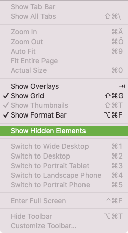
Or you can use the menu “View” as well, to toggle hidden elements:
1 Like
OMG @Shadowfax … thank you so much for that information. You just saved my sanity!
I was about to give up on trying to create a mobile device version, but with that information I can indeed do it with no issues.
Best
Scot
1 Like
I just make one site for all, no special mobile site. The amount of extra work…!! Also, I never like to be served a mobile site when I’m browsing on the phone myself, so I don’t want to put this on others either.
@Sven I’m with you totally, and I don’t enjoy mobile sites at all. I just don’t know how much google will drop your ranking score if it’s only for desktop though. It would be nice to know!
Well, search for Tramfabriek and you know… I’m number 1!  Even on the phone. (Hm, don’t like the random page image Google search results presents to me from my webpage. Have to figure out how to change that).
Come on guys @rimram and @Sven you can’t be serious with that statement! If you do the research you will see that mobile users are now 55-65% (90% plus for local searches) of all total search results and that number is only increasing! And Google red flags your site and demotes it if you don’t have a mobile version to serve up to users who are in need of it. This is also stated in their policy.
@Sven, when done correctly anyone who puts in their website’s business name will come as top dog, but what you should be concerned about is how are your clients finding your website when they don’t know your business name or that your business exists.
I have several clients and the majority of their traffic and sales come via a mobile device.
3 Likes
@FlaminFig Yes thank you, It’s good to know how important having a mobile version of a site actually is  I’m going to make a mobile version, but I think I need to study and look at some mobile sites that have been done really well. I’ll have to do a google search and find some.
I agree with greenskin. Having a mobile version of a site is necessary today. When a smartphone does not build your website within 3 seconds and the site is not mobile, the visitor is gone.
You should definitely try to make a mobile version of your site in Sparkle. It’s really worth it.
https://sparkleapp.com/docs/devices.html
Suggestion: if you want to make your existing site mobile, make a copy of your project. Open the copy and create the 320px device and try to make it mobile.
Grtz,
Raf
1 Like
I have designed each element at a time first in desktop then in mobile this seems to work best for me. I would first design my layout either on paper or in sparkle and just make another page until it looks like I want it to take a bit longer but not so much.
1 Like
@Izhane That is certainly also a good way to create your mobile site. When this way is best for you, go for it.
Grtz,
Raf
@rimram. Yes, that drove me nuts as well until I was schooled like you. “Hidden elements” is a cool feature that’s essential to my audience 80% of which use their phones in portrait.
One of the biggest pains in web life is finding a site on a mobile that is simply serving up a desktop version of the pages. It involves having to zoom and pan the pages in order to read it! You only have to look at some of the showcase designs from the Sparkle website on a mobile device to see how frustrating it can be. There are some beautiful designs, but many simply fail when it comes to mobile versions. I don’t know many people who will go through the motions of having to look round a desktop site on a mobile. If it doesn’t look, feel or work like a mobile app - most people will leave and look elsewhere. Anyway, one of the primary reasons for using Sparkle is precisely because it can create adaptive websites that work across all devices.
@francbrowne
I agree with your statement … it’s very frustrating to look at a desktop website on a mobile device. That’s why a mobile version is so very important these days.
An additional step, but worth it. 
1 Like
@francbrowne, Very true! You might as well say nowadays that mobile is king!
The average is estimated now at 50-65% of your website’s traffic is mobile so not building for mobile leaves “big-money” on the table. Please do not frustrate your users because 73% will never be back!
Also as a side not… the free showcase designs on the Sparkle website are meant for an intro/starter and has only been build for the desktop device. Whoever downloads them will see it as a learning tool and if they want to use it and modify it for themselves then they need to introduce the tablet and mobile devices…
Yes, I understand that’s what the showcase sites are about - I was simply pointing to a convenient source of reference for those that want to see what a desktop-only site looks like on a mobile device. I wasn’t inferring that the showcase sites were anyway inferior - I actually like the designs and think it’s very good of users to make them available for others to use as a launchpad. But, I agree wholeheartedly with the point you make about mobile users - they are becoming the majority of website visitors in this day and age and shouldn’t be ignored.
