Hi, I am trying to add a popup inside a popup menu for mobile version of the website, I want the visitor to click the Botton and additional items to be viewed under this item such as a dropdown.
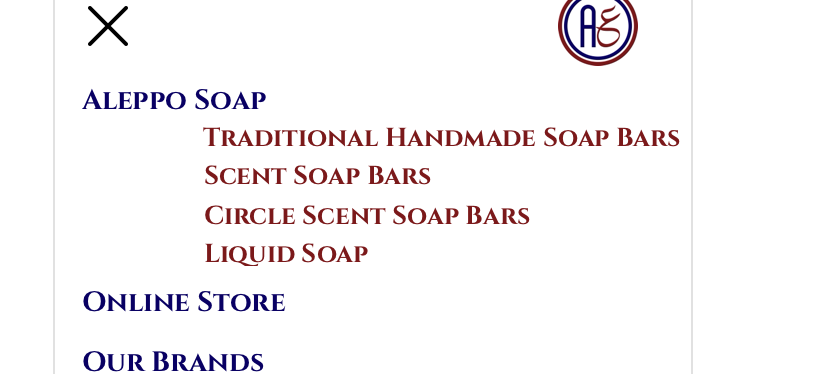
I attached a photo, I want to click the button “Aleppo Soap” and then it will show buttons on the red color to choose from.
Is there a trick to do so?
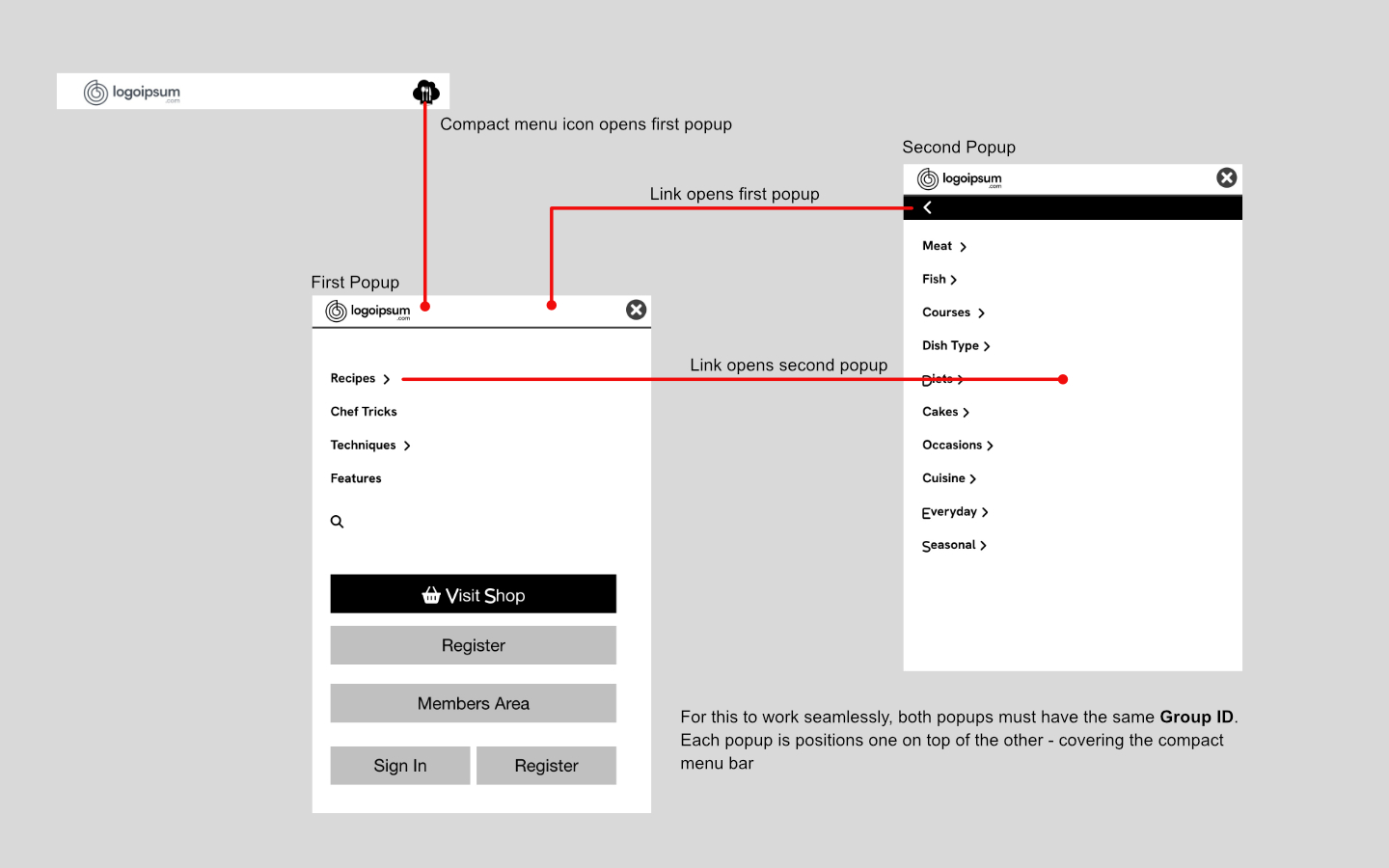
It isn’t a Popup WITHIN a popup as such - its a second popup that gets triggered from a link in the first popup, When the second popup appears, the first one is closed, replaced by the second one. Therefore, to make things seamless, you need to add a back link to the second popup that triggers the first popup. The diagram below should clarify how this works.
1 Like
Frank’s method is neat and excellent for keeping only one popup open.
(BTW @francbrowne: Thanks for the book; very useful  )
)
Also, as noted in the Sparkle documentation, you can keep multiple popups open using the Popup Group ID function. Think of it as adding a hierarchy to groups of popups. In your example, the first level (Group ID 1) could stay open and the second level (Group ID 2) be an off-set overlay atop a section of the first. A tap outside the overlay closes the second revealing all the first. Strictly though, as Frank indicates, it’s not an embed.
I’m working on a form of this currently for one of my clients, only available on a ‘staging’ site presently. The image shows three layers (button, Level 1, Level 2) and buttons within each popup navigates back and forth as needed. A tap outside closes one layer or all.
One of the fun aspects of Sparkle is discovering creative methods to present a website. 
2 Likes
Hi
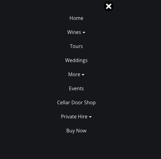
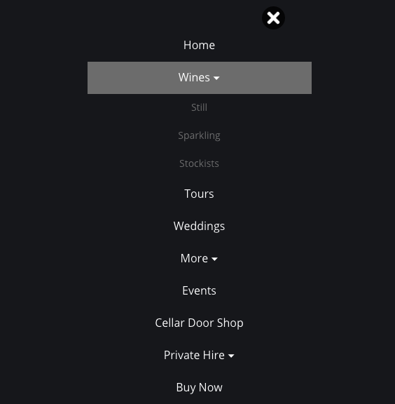
Could this not be achieved using a menu? I have something similar to what i think you are trying to achieve by doing it this way. The mobile menu is called by pressing a menu button, that opens a new popup. Within the popup, there is a menu, and you can arrange your menu to have items under other iteams.
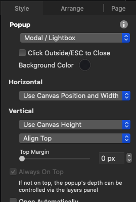
By clicking the button top right, it opens a popup, use pop settings like below
To show a popup like this (add a menu inside this popup) to look like below
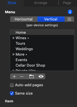
Menu settings like below (place pages inside of other pages)
When you click on one of the menu items with pages inside, it will look like this (click or hover on ‘wines’ to view still, sparkling, stockist’ pages:
Try it out on the mobile version of this site
Good suggestion. Perhaps the formatted menus could work for @Theilluminance.
Sometimes I use formatted menus, especially when needing text only, every level similar, and terminate on specific pages/anchors. However, I prefer popups when needing greater formatting flexibility and, particularly, when adding information/images on Level 2 might reduce the steps to an action.
In @Theilluminance’s case for example, selecting a menu-based “Scent Soap Bars” usually would take the visitor to a page with additional information and options to buy presumably. However, if the visitor seeks information (still in the comparison stage), one cannot easily now select another option, say “Circle Scent”. The visitor must reselect the menu and then tap back through the sequence to another page.
However, a Level-2 popup allows a visitor to simply close it for immediate re-exposure to other options and, when positioned correctly, have the comparison options present the whole time. Additionally, the Level-2 popup also can include photos, text, buttons, etc. while the standard menu cannot. Yes, arranging the various popups takes some time but (hopefully) provides a better experience for the visitor.
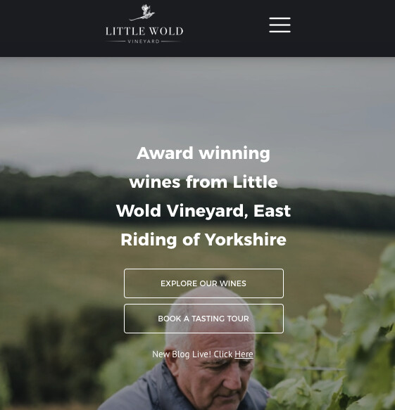
BTW: Your Little Wold Vineyard site is very attractive and easily navigated. Very nice.
(FWIW) I stumbled, however, on the lengthy centre-justified paragraphs on multiple pages, the Privacy Page particularly. Left-justified paragraphs make text more readable. Some even suggest to never horizontally centre a paragraph of text (see linked article). When used occasionally for things like short quotes or call outs, centre-justified text actually then stands out more. See the image to demonstrate (see original article for explanation):
(Why You Should Never Center Align Paragraph Text):

For me going crazy with the main navigation menu is never a good idea for the end User. It just causes unnecessary overwhelm, which leads to a psychological disconnection!!!
The main menu is the way shower like a signpost.
Once I’m there then you can offer me further sub-navigation to make my life easier.
Thank you all for the help, I have tried @andymaltby way and it worked as I would to, however; if only sparkle app allow to add layout block to the popup, then every thing will go just perfectly.
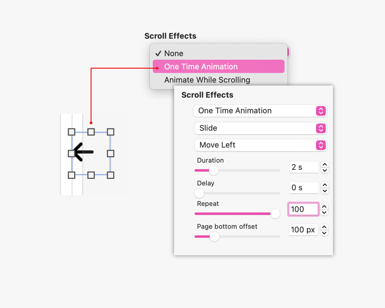
Quick question, is there a way to add arrow animation on the mobile menu?
The website update is live now: www.akkadtrading.com
Will appreciate your feedback.
If you’re talking about a plain text menu - the answer is no. But if you are using Popups, the answer is yes. Simply add an arrow icon in a text box with the insert icon option. Make the text box just large enough to accommodate the arrow. Remember, the width of the text box would determine the distance of movement, so you need it to be as small as possible. With the text box selected, apply a one-time animation to it, such as slide/left. Set the duration to something like 2 seconds and have the animation repeat about 100 times (should be long enough for displaying in a popup).
1 Like