I can’t figure out what’s causing the problem. The preview shows the site correctly but the live site is messed up about half way down the page. Text boxes are missing. Images are swept to one side. Footer is totally missing.
Again, everything looks properly in preview. Any ideas?
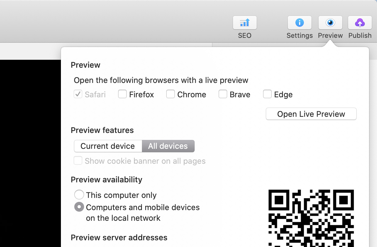
@FantomSolace, If you have designed for the one device and then preview it as a “Current device” in preview then you will see something different in your browser once you have published your website like what you are describing. Make sure you have “All devices” selected to see how it looks in Preview before you publish your website on your server.
Also remember that if you have designed for the 960 device and view it on a smaller device like a tablet then your layout will look all over the place on the tablet. To make it look correct on the tablet you’ll need to introduce the 768 device, and the same goes for mobile.
Hello, similar problem…but if i change the view for PC, then tablet and last mobile its change all my pages…for example: i correct all views and went back to PC View its messed because of mobile or tablet. I can not fixed it… why? I tried to say of every site “show only of this site” and not copy for all sites, but doesnt work. Is it a Bug?
PLEASE Help and thanks in advance!
Hi @Sammy, actually sounds like a different problem, though I’m not quite sure I understand everything you wrote. You are referring to something that happens in canvas alone? Can you provide screenshots?
Oh duncan, thanks but this is not my problem. My problem is in sparkle. Im Building my Page. With Box, Text, Galery…then i Change to tablet and mobile…i have to Move and change the object like bigger text, bigger pics, and and and…
After that i look back to tablet and PC view and all of my settings brokes, so the PC views moves and shift in the wrong Position after my mobile settings. I can not fixed it. Its difficult to explain because im from germany
Hi Sammy. Did you check the tutorial on youtube Making a page responsible
I just did my first project today. Start with the PC 960 version and then adapt the Smartphone 320 portrait accordingly. Other devices set to “automatic”.
By the way, i’m from Germany too.
You nailed it. The issue was caused by web optimization tools utilized by the hosting service. Turning off the optimization immediately resolved the issue.
This is also very helpful. I am aware of the different devices and how the layout is impacted. In my case, the previews were accurate. That worked great. The issue ended up being a web optimization. I didn’t bother trying to figure out if it was an extended cache or one of the other settings, but turning the ‘one key optimization’ they offer solved the problem.
I am having a similar problem with Preview vs Live View. I am using nanogallery2 to create html to display albums/images from my Flickr account. This worked before I upgraded to Sparkle 3 (however not sure the upgrade caused the problem). In Preview everything works fine, although the gallery of photos comes up at 3 across when it used to be 5 across. But after publishing, the album links are unresponsive. I checked the server settings and optimization is disabled. Below is the link to the page in question. Any ideas? Thanks.