I imagine this a question you get all the time but, when I publish my site I check it in Preview and everything looks fine. I publish and it looks good on the computer I used to set up and publish (I-MAC). I look at the site on my PC laptop and there are errors in spacing and hidden text. I can’t see the errors in Sparkle to fix them. How do I fix the errors? i assume this a device layout problem? The “device” box says it is a fixed layout for 960 PC’s?
1 Like
Making progress. Figured out how to get the PC layout correct using the 1200 layout and Preview. However, viewing it on my iPad it still is wonky. I had assumed that it would scale to the iPad or does it need the 320 layout for it to format correctly?
1200x is for wide desktop PCs, to view it correctly on tablets you’ll need to activate the 960x and 768x on Automatically Scale, else it won’t
The way I go about it is ! create the 1200 (covering wide desktop, laptop, and landscape tablet), 768 (covering portrait tablet and needs to be used otherwise portrait tablet picks up the 320 which looks all wrong), and 320 ( covering portrait mobile).
I don’t concern myself with the 960 (1200 covers this) or 480 (statistics show this is mostly used for video watching) nor do I use autoscale.
Can’t really help without understanding specifically what the issues are. We expect Sparkle sites to show up as designed on Macs and PCs alike. This assumes you have used the devices feature correctly.
What browser did you use on PC? Can you screenshot the Sparkle and PC versions in the problematic areas to show what’s wrong?
I fixed the problem of PC view by adding the 1200 site. I assume I will need to add a 320 version for tablet and phone viewing? When I load these sites to the server how does either the server or the viewing device know which version is needed?
Yes you will. Responsive web design is a concept of techniques that scales the content to the viewport (or the view device, as you stated). Setting those devices get your website / content “readable” for who’s loading the site. This responsiveness is at the code, meaning you do not need to worry anything about this besides designing each Device size. If you dont, you’ll have the exact same problem you’ve stated at the start with the iPad.
Since I update a calendar list almost daily will I need to do an update for each version separately?
Well, if you’re doing a manual calendar, then yea, all info should be adapted and updated separately… you don’t need this depending on how you set up your calendar, but I can’t help without knowing how you’re doing it.
I’ll add that when your iPad (for example) talks to the sever where your website sits then the uploaded Sparkle code detects it is a tablet and serves up the 768 device. Depending on which iPad you are using (mini, standard, or pro) the 768 device will scale.
I’ll also add that if you have calendar text across devices then any edits you make to the text will update across devices. But if say you add an extra element of text (aka text box) then you would need to adjust its layout and font size per device.
Its not really a calendar in that sense, really more of a chronological list of dates of shows available to attend. I’ll probably use large text boxes so I only have to move text within the boxes and not have to go thru each page and different device.
Hi! Have you thought about embedding a Google Calendar in your site? They offer a list view, perfect for your purposes.
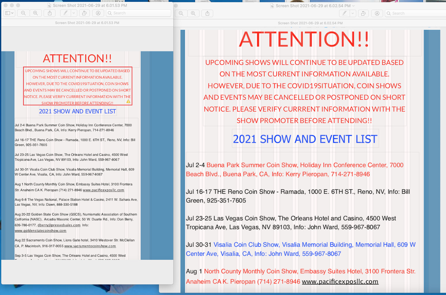
Have done 1200 and 960. Working on 480. Does anyone know why text colors dont follow thru the layouts?
And if I make a text change does it follow thru the publishing, or does each layout have to be published separately ?
@jimjumper, Answering both here…
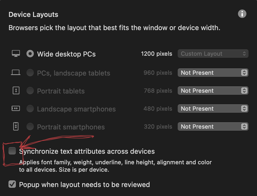
- Text colours flow through the devices if you have selected it by going to the Devices / Synchronise text attributes across devices and ticking it
- When Publishing everything you have done is converted to html/CSS/javascript, everything!
Yes it does…
I have just tried it on a 960 device and writing many lines of text in a text box I coloured a few lines red. I have the Devices / Synchronise text attributes across devices ticked.
I then created a 320 device and the colour and font styles came across. I just had to increase the font size for legibility.
Question : Have you updated to the latest Sparkle V3.1.1?
The box is ticked and the screen shots were taken within 1 minute of each other. One at 1200 and the other at 480. I am publishing todays update and I’ll check when its done loading. I am running 3.1.1 (8500).
Hello.
This is really puzzling. I tried to simulate the error, but without success. Actually I am in the dark.
How did you proceed? Does the red / blue text have its own style? Is this saved, without * at the end?
Did you adapt the styles from the 960 px layout to the smaller layout and saved them with the same name? You did not define different styles for each device?
Mr. F.
I am not sure what is going on.
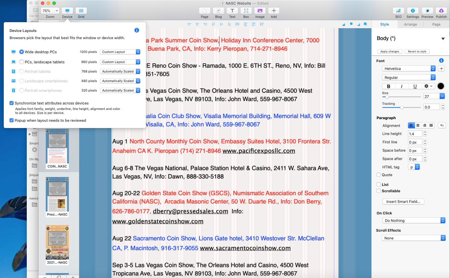

As you can see, the only thing I changed between the 2 shots is the layout selection. The cursor is in the same place both shots and both show the font color as black. The Synchronous box is checked but obviously they aren’t. I’m thinking I’ll just manually change the colors to what they should be and see if the 480 layout then syncs up with the other 2 layouts. But it is strange…