I uploaded my new photo site created on Sparkle this evening, replacing a site I designed in Sandvox a number of years ago. The new site looks great in Sparkle and in previews from Sparkle, but the published site looks all screwed up.
I’ve checked it in Safari, Chrome and Firefox. It looks the same in all three browsers.
Text and boxes aren’t in the right places. The header/menu bar is missing from the home page.
Not sure what I did or what I need to do but this is surprising and disappointing.
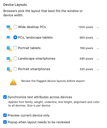
@Pat, it is an easy fix! I would check the Device tab, top left of your Sparkle canvas and see which devices (aka breakpoints) you have selected and then check the layouts of those breakpoints. I’m going to suggest you have not adjusted it for the selected breakpoint(s).
Your second screenshot shows me you are viewing it on 960+?
When I check your breakpoints your site has not been adjusted correctly for mobile or desktop but your tablet breakpoint shows fine and is what you have in your first screenshot - the Sparkle canvas.
OK. Maybe I’m misunderstanding the Device tab. The only one I have selected is the PCs, landscape tablets. I assumed from my reading that designing it for that width would be fine for web browsers.
Guess I get to kill this off, reload my old site, then go back to work on this for the wider site.
Greenskin: Thanks. I went back and re-read some things for about the fifth time. I deleted the other devices from the device layout screen because I just want the site out there right now. I’ll work up other devices a bit later. Everything worked once I deleted those and republished.
@Pat, Sparkle presents responsive fixed-width breakpoints, aka “device layouts”, not responsive fluid-width breakpoints so by creating your site in the 960px people on tablet will come across issues and people on mobile will just be outright frustrated. So if anything else it is wise to create a website for the 960, 768, and 320px breakpoints.