I see a few problems with resizing my browser window. As I make the browser window smaller, some text gets too small to read, then gets very big, and sometimes the footer gets tall and covers up some of the information. It goes through different variations as I slowly make the window smaller. I think there should be adjustments like stacking images and text, but that is not happening. The images just get smaller, but stay in the same place. Not the same for the preview - here there is stacking, and the text stays generally the same size, and stacking occurs, but, the order of the images changes. Something at the top is suddenly down the page after other things. What is happening here?
Hello.
Before the big guesswork starts, describe for us how you set up the various device layouts. Or post a screenshot of it.
I’m assuming there’s a lot of automatic in there.
Mr. F.
Sparkle has what is call a fixed width responsive framework so when you make the browser window smaller Sparkle will scale things down until a breakpoint (aka device) is reached. At that point the next device kicks in. This is the nature of the fixed width responsive breakpoints and shrinking the browser.
Yes, that is what I see happening, but at certain points, before a breakpoint, the text is too small to read, and then it jumps to being even bigger than when the window is full size. On other sites that I look at, the text remains the same size, and the various blocks of image and text start to stack, and the transitions are smooth. On this site here, for example. Oh, now I see that the text doesn’t get bigger on the published site, only in preview.
I have been making different layouts for five devices, but this has been so time consuming. Yesterday I switch to just doing desktop PC’s and portrait smartphones, with the rest on automatic. Much easier to manage, but I found no difference in terms of this problem.
Yes this is time consuming. From my experience all this automatic resizing is a misconcept or misunderstood at least. Simply because, text has to stay readable and text with 2 or 3 or 4 points is and never was readable.
I guess this concept might have been done many years ago for some reason when mobile was not the most important viewport? I have no idea. But most apps might have a huge issue with text to resize it automatic, so … .
For example Adobe Muse had a feature: keep all text settings for next or for all breakpoints/devices.
This is something to might be very very useful for sparkle – it would speed up this terifying process of text styling through every device a lot.
Same to elements but in a much different way like: keep size and position to next breakpoint/device – but this is not your post, I know.
Advice anyway: “Simply” create an empty page before starting with your site - in your case, do it now before going on and getting too frustrated - and set up your text styles for all devices from “h1”, “h2”, down to “p”. Like this you have the most control over your text styles across all devices.
I for myself, wanting people to read what my clients want them to read, no text is smaller than 18pt. Headlines “h1” are always much bigger than “p” to keep it kind of consistent.
Hope that helps,
Kind Regards,
Uwe
1 Like
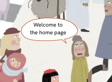
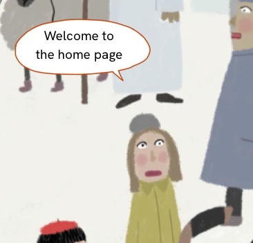
As a novice, I did not set the style for any of the text, so now I will, and that may help the problem. At the moment, the text becomes way too tiny, and then way too big. The menu completely disappears on small windows. But the resizing of the window is causing other problems as well. This has to do with the relative placement of text and images. Here are screen grabs at various browser window sizes. You can see that I need to have the ballon and text stay with the image behind, but I have found no way to anchor those two things to the image underneath, which is full page width. I tried a full page width layout block, and other layout variations. Any clever ideas for how to fix this?
I have found a workaround. I combined the balloon and text with the background, making one graphic. Because the text is the title for the page, I had to keep it there too, so I made the colour transparent.