The post heading says it all and I’ve tried everything to get a decent fit. The design looks OK for the moment but I can’t upload untill I get this looking right!
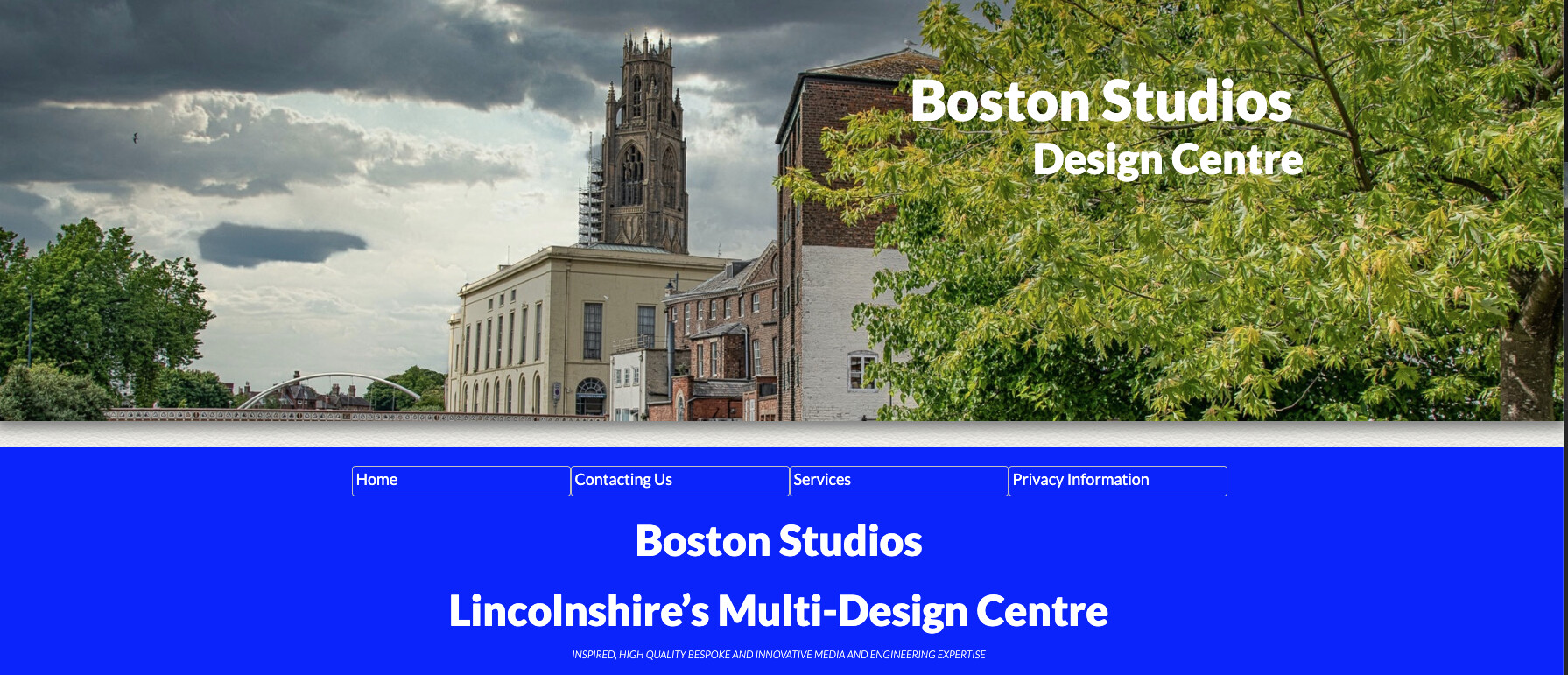
The design looks like this (1 device of 1200px used)
Roger. You are previewing with Safari. How does it look when the site is uploaded. View in chrome and safari if you uploaded. I’m following this thread.
Thanks for your reply Bill, I’ve just uploaded it again and the results are the same as the preview. Have cleared all caches in all the browsers but no difference I’m afraid - I mostly use Microsoft Edge and Safari for previewing by the way. Please have a look here and give me your opinion https://www.boston-studios.co.uk
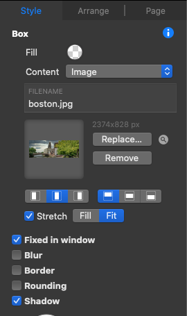
Some of the image controls give strange results such as the stretch/fill, fixed in window and the image position i.e top/centre/bottom and left/centre/right justification.
The problem is a full width image has a fixed height but a variable width. Inevitably the image will need to stretch, because of the changing aspect ratio of the container box compared to what you see in Sparkle.
You can control what part will be visible somewhat, by pre-cropping the image to have the content you want visible in the top, center or bottom part of the image, then setting the alignment of the image to match that.
Roger - Duncan is correct. I had trouble with this as well in the beginning. Im usually doing my own photography now and purposely shoot in a particular fashion to match Sparkle. That head image is terrific. As Duncan mentioned crop, zoom in if you want. Play a bit. You’ve got a full parallax version of the same picture lower in your page. Its a great site. Well done. excellent use of parallax.
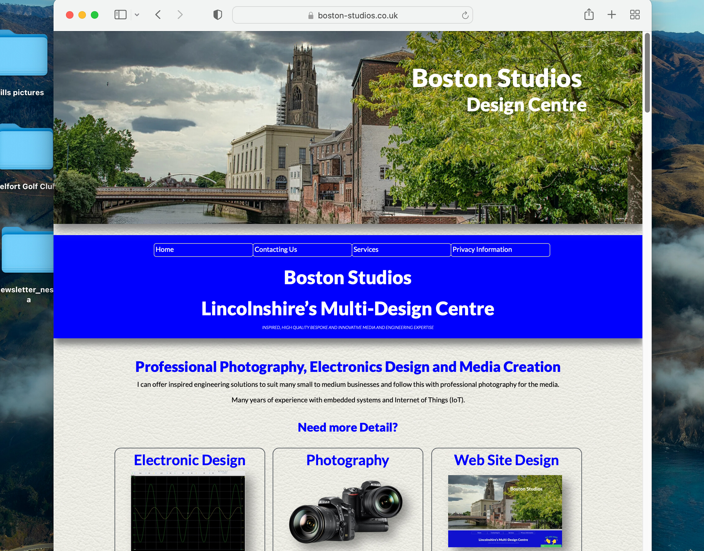
Actually I just checked again with a desktop Mac and it looks like you’ve got it. (in Safari) Squeezed the browser down to phone version and looks just fine. Great that you’ve found the solution. Attached screen shot.
Roger, think of it a bit like this. Sparkle is your pasteboard. It’s where you lay everything out and the board doesn’t change size. It’s static. And then you come along and look at that board through an overlayed window (browser window), but the browser window can change shape and size. You’re going to see variations of what’s below. If you stretch the browser window down as far as you can go, you will see more of your image below. Unfortunately, the internet is a very fluid beast. I spend half my life colour correcting, sharpening and getting things absolutely perfect on a £6K screen only to find out that someone is looking at my work on a £200 laptop whose screen is bright blue and low res. Not like the good old print days but it has many more advantages. Always a compromise! Good luck!
Hi Bill, I’d be most interested to learn if you shoot your photographs in any different way or use different settings to shoot for a header for instance so that I can improve my workflow.
I mostly shoot in RAW mode, use lightroom/Photoshop/Luminar AI, and others such as ‘Acorn’ to process and resize ready for use, then I use an app called ‘Squash’ (its a drag and drop app) to reduce the file size somewhat - I can often get a 75% or better size reduction!
Also thanks scoutdesign, every little piece of information helps!
Not sure if I have a problem or not as I only use the desktop layout on my site and let Sparkle deal with the different device sizing so changing the browser window size changes what amount of the image can be seen. It all seemed to be OK in v3 so now checking again in v4 and in WordPress for comparison!
I still don’t get why if I select image>stretch>fit it doesn’t actually fit width-wise and fill doesn’t do the expected fill but oversizes to the extreme!
Even so, Google still complains that the text size for smartphones is too small! Could anyone please have a quick look at this behavior or is it me?
Head picture is fine, windmill is great, then the building, tractor, and animal picture are blown out, or zoomed dramatically after v4. I’m following this thread with Roger.
What browser/device were you viewing this on Bill as I can’t reproduce that at the moment.
What I have found is that, in upgrading to v4 it had changed some of my image settings from stretch>fit to stretch>fill and that may be the effect you are seeing.
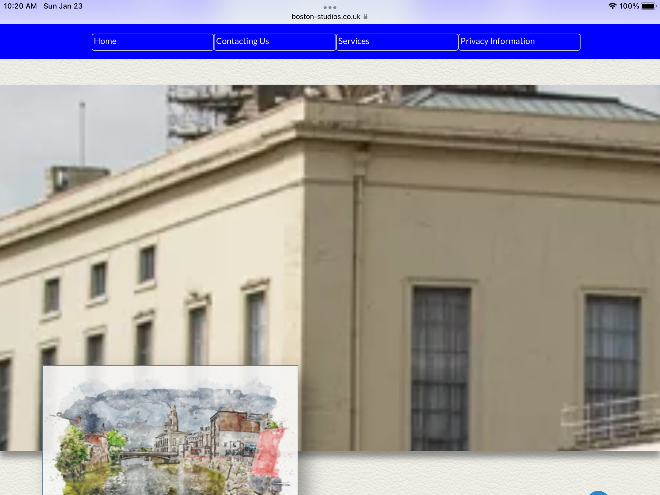
Corrected and uploaded again but when viewing on an iPhone all images are reduced in width for some reason! Other device are OK such as iPad Air, PC laptop etc
iPad, and laptops are fine Roger. I also viewed on an iPhone in portrait and see the whole site in a much smaller screen.
The recommendation that @duncan has suggested is correct. You’ve designed the 960px first, then moved to the iPhone.
Now you must decide how to arrange the elements independently for iPhone only. At the moment the iPhone view is just the mini version of your website. The iPhone view is a different animal. Remember that “show on this device only” is your friend. Font size increases, a hamburger vertical menu must be used. Some text word smithing etc. I think you know what I mean. At times you may have to hide text blocks and add blocks for iPhone only.
Sometimes the special effects used in phone views don’t have to be used. I’d turn off the “automatically scaled” on the iPhone device and try to make it totally independent. I design my iPhone variant in the custom setting. You won’t lose your elements and you may want to stack everything.
Because your offering a technical site, web design, audio, photography; these subjects can be stacked. Your separate pages will be much easier in design because they’re basically text and a couple of images.
I’m often reminded and remind others that viewing on an iPhone is like looking at a postcard.
I’d take a look at the “automatically scaled” option to fix some of the iPhone viewing problems.
-w
Thanks Bill, It seems that this is a learning curve for many of us.
I think my problems started with my first Sparkle site. In retrospect, it would have been better to have started with my home page and then added more devices as needed before creating more pages. Not sure how others have approached this problem.
I’m now faced with 12 pages on that site that were automatically scaled (and Sparkle doesn’t do a bad job on it) and now adding custom devices, even just a 320px is going to take hours as Sparkle has placed elements all over the place. This may be due to the fact that the site started out in v3 and was tweaked in every way possible just to see how it worked! When I get the time I’ll have a go at it.
In the meantime I have a Google issue in that although Google knows I am there it refuses to rank me in search results for straightforward queries. The only thing that I can see as a problem is the Google maps that I show do not meet their standards/policy so for the moment I have deleted them and the page(s) in an effort to get Google to look again more favourably. I may make up another post/thread for it!