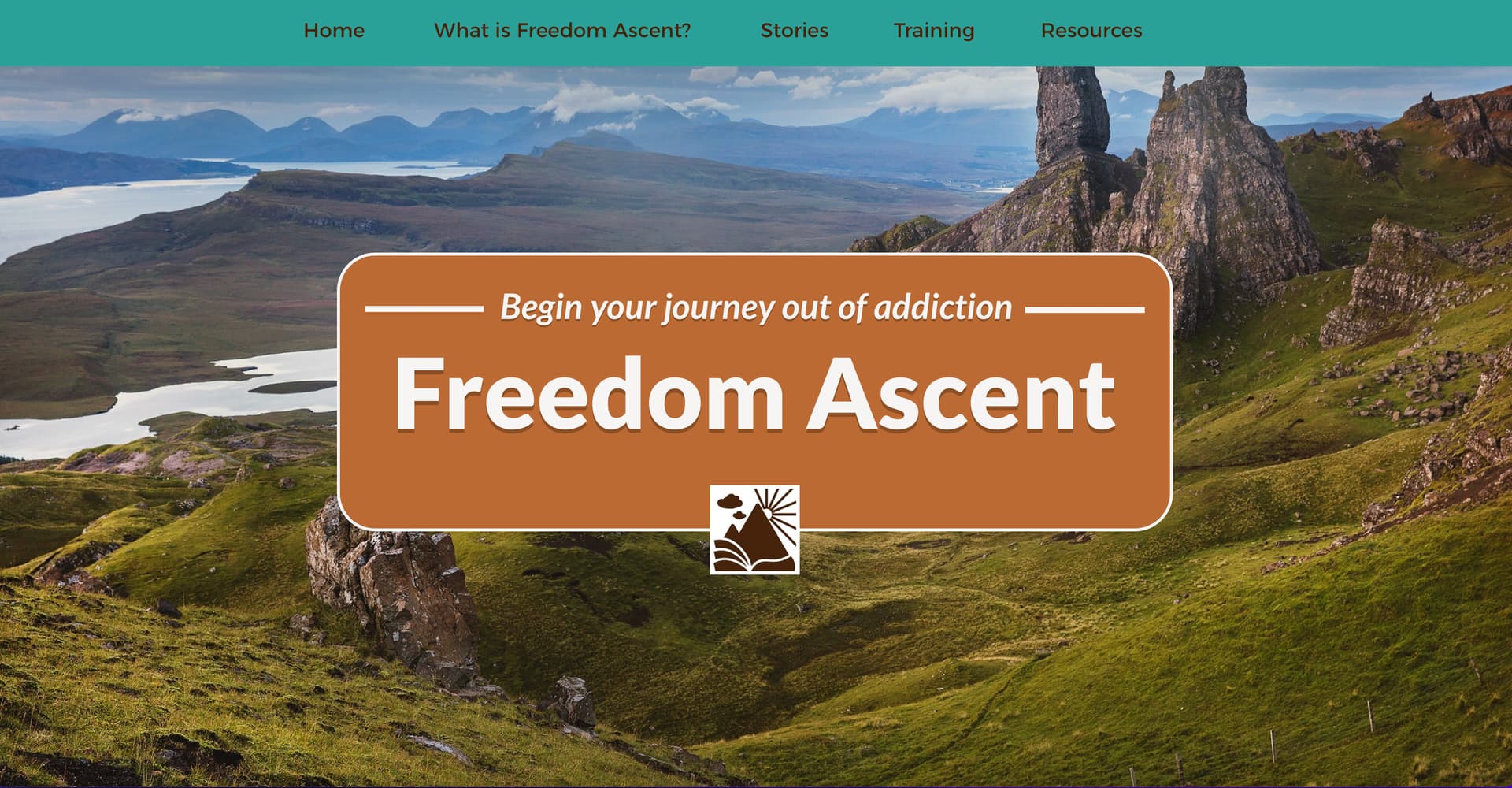
I’ve set up a website for the layout of PCs/Landscape tablets. Everything looks great when I preview it on my laptop and/or widescreen monitor.
Not so much when previewing for smartphones: when I set it for custom layout for either landscape or portrait views, it has lots of issues, one being the rounding of corners on boxes. When I change the rounding amount on either of the two smartphone layouts, it makes the same change on the layout for PCs/Landscape tablets. How can I keep it from doing this? I figured I would have to do some tweaking on the smartphone layouts, but this makes it impossible.
Also, if I set the smartphone layouts to Automatically Scaled, some of the image boxes are out of vertical alignment. Any suggestions on that?
most settings are not independent on different devices. Arguably they should be but for the time being what you can do to change them independently is to duplicate the element, use the “show on this device” option selectively, then change the settings of the now separate elements.
About image box vertical alignment, it really depends on the setup, please share something about that and we can take a look.
So while looking at a smartphone layout, I should duplicate a box with rounded corners (which places it on top of the old one), change the rounding number, and then check or uncheck “show on this device”?
Correct. Also back on the desktop device, uncheck show on this device for the box that’s only supposed to show on mobile.
This is a lot of work for just corner rounding, but is generally applicable when you need to have distinct settings for the same element depending on the device.
Thanks Duncan, I will try it. Also, since there are two smartphone layouts (portrait and landscape), I’ll actually have to do the same for both of those, resulting in a total of three sets of elements, each one checked “show on this device” only, while the other two layouts’ elements are unchecked. Wow, to bad Sparkle won’t simply allow me to check a box that keeps all layouts and their changes separate from one another!
I think you can safely set the 480 px layout as “not available”.
Some here - including myself - do it that way.
But try it out first. It would save you work.
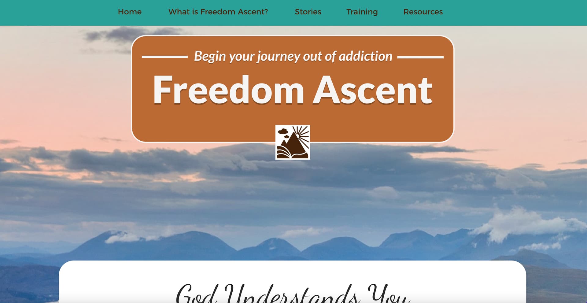
That helped a lot! The only small thing now that I see on my smartphone preview is that for the background images, I have to uncheck “Fixed in window” or otherwise they only appear on the left side of the screen! Unchecking that disables the parallax feature, but otherwise makes the entire webpage look normal.
The philosophy discussion about the different layouts is open again.
As I said: try it out. It is up to everyone how much work he/she puts into the website.
If you have the layout for portrait tablets, be it customized or automatically generated, that should be enough for a smartphone in landscape mode. You can test it on a Mac by switching to responsive view.
If you click on the name of the device, you can also switch between portrait and landscape.
So now I’m noticing that when I uncheck “Fixed in Window” on the background photo at the top of each page to eliminate the left side shift on smartphone layouts, it also zooms in some on the center of the image, showing a smaller section of the overall photo when “Fill” is checked. And that really screws up the look of the website pages since each image was specifically chosen based on how it appeared when “Fixed in window” was checked.
Now, to avoid having to do a lot of work mentioned by Duncan above, I have to sacrifice part of the overall design and look of the website (parallax, proper image placement at top, translucent logos with blurred background images) for better overall functionality on smartphones.
These issues defeat the beauty of the Sparkle design template that I downloaded and adapted, as well as Sparkles own template designers. Any suggestions?
The layout design for mobile devices is not as easy as it seems.
I build nearly the whole mobile site from scratch.
Many parts will not shown (uncheck) on this devices and vice versa.
If you want it perfect you have to do the work.
Basically fixed in window has the image behave as the web page canvas.
A normal background image doesn’t do that and therefore the difference you have highlighted in your screenshots…