I always thank the guys at Sparkle and Duncan for creating the best program ever on Mac for creating websites. After the departure of Adobe Muse and Apple’s abandonment of iWeb, Sparkle is currently the best solution capable of guaranteeing each of us the possibility to create a fast and functional website. There are other realities out there, but I continue to think that Sparkle is the best and that it has great potential.
Precisely because I think it is the best, I always hope that for us “visual designers” Sparkle adds more tools so as to work with more comfort.
Here’s what I think should be improved or added:
-
IMAGE MANAGEMENT
When you upload images to a page, they have limited management possibilities. Using the menu buttons, you can position the image in the center, top or bottom, right or left. However, there is a lack of a system that allows moving the image within its frame to compose it as desired. The problem is overcome by cutting the image outside of Sparkle with a graphics program. However, it would be nice if this “cutting” could be done also in Sparkle to have more flexibility in working with images. -
RULERS
Sparkle has a grid system that is functional enough and in many cases may be sufficient. However, personally, I miss horizontal and vertical rulers that could help me arrange objects using visual references for both horizontal and vertical space. I believe that a program with a “visual/visionary” vocation like Sparkle cannot do without it. Also, pure designers could create their pages as if they were in front of a desktop publishing software, which, after all, seems to be the spirit that guides Sparkle in building its pages.
I found a solution: I upload a grid background and regulate the positioning of the elements according to that grid. It’s a practice that gives me more work, but this way, I partly solved it. However, I can’t deny that if I could create grids directly in Sparkle through rulers, pulling down lines, it would certainly be more convenient. -
COLORED CURSOR
On some occasions, when you work with a lot of text and need to write or delete parts, the cursor disappears, as its color sometimes coincides with the background. In this case, it would be useful if the cursor changed color based on the background color, to allow easy use of the text. I must admit that sometimes its coloring is correct, but other times I go crazy because I can’t see it and don’t know where it is. To solve this, I write a series of “XXX” in uppercase because, seriously, I lose sight of it. -
JERKY OPERATION
When I create pages quite full of objects and try to extend the workspace downwards, I find that Sparkle is very slow in updating the length of the page. Indeed, I click on the handle, move the page length margin down with the mouse, and the new configuration appears after several seconds. I don’t know if it has ever happened to you, but having a new generation Mac Studio with 32GB of memory, I don’t think it’s a problem related to resources. This happens often. It’s a bit annoying because Sparkle never actually crashes. But… -
GROUPS WITH TEXT BLOCKS
I often find that to arrange objects to fit the design of the page, I decide to group them. This allows me to manage them together, enlarging and shrinking them in one go. However, if I group objects with text, and change the size of the group, the size of the text remains unchanged whereas it would be nice if it also shrank. The problem is solved by rearranging the text immediately afterward, but wouldn’t it be convenient if the text also followed the resizing? -
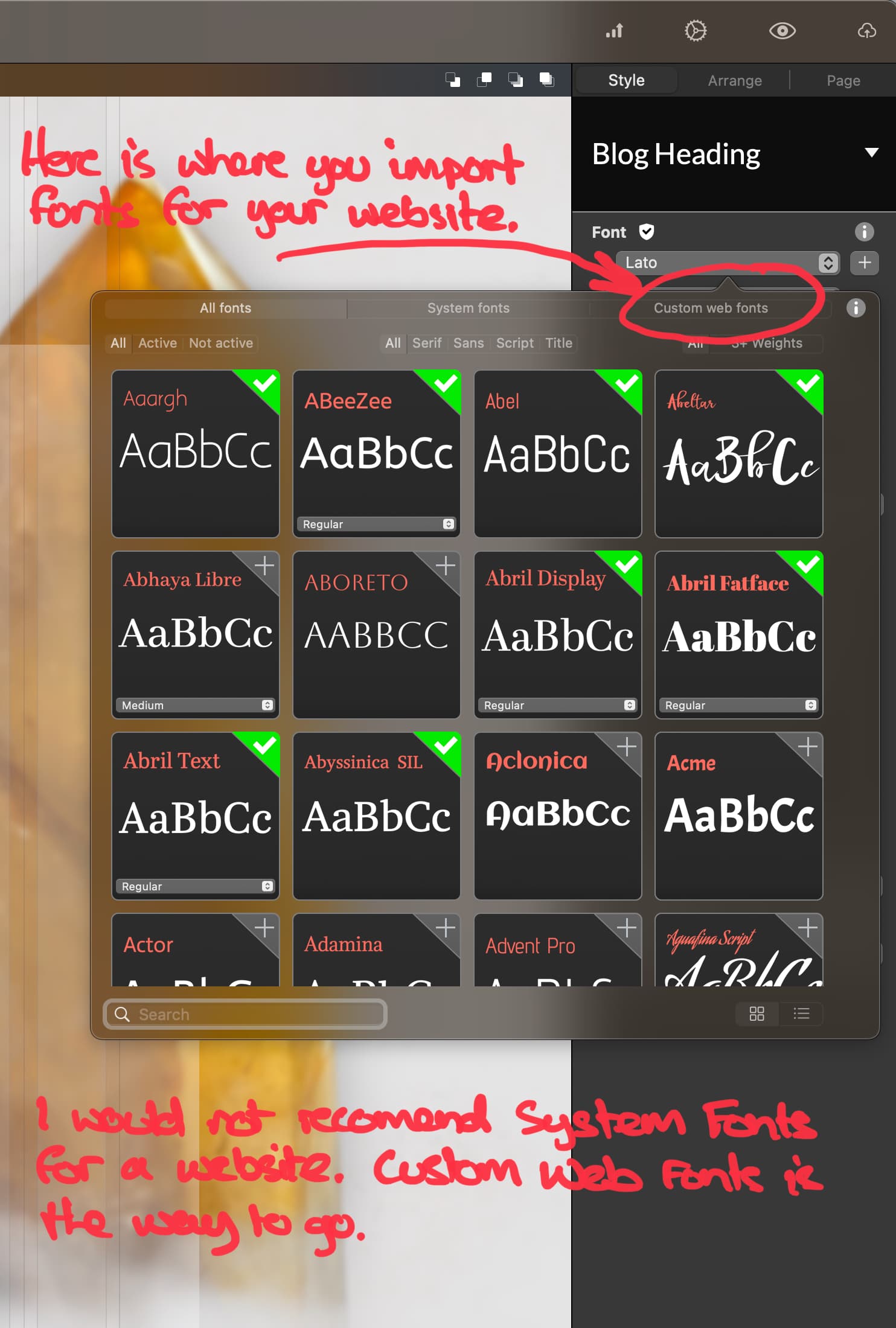
FONTS
As a designer, I would like to be able to use my fonts and not just those from Google. Here too I understand that there may be a choice related to the correct management of fonts. But why not allow Sparkle to use system fonts as well and then, if they are not compliant, transform them into an image at the time of website publication? Wouldn’t it be more convenient than working first on a graphics program, composing the text with the font you like, and importing it later into Sparkle? With the risk that if you change your mind about a word, you have to redo the whole process from scratch? -
COLORS
I continue not to understand Sparkle’s color system. The colors are essentially locked to 21. If I wanted to invent a color number 22, I can’t do it because there are no free blocks. This probably depends on the fact that really no one would use more than 21 colors for their site, yet the fact of not being able to add colors makes me feel somewhat chained…
What do you think?