Hi there ![]()
This year the Sparkle team contacted us (relajao.es) to design the new website and asked us if we could do a post explaining how we did it, so here we are. We also did the promotional video and the screenshots for the Mac App Store. As you may now we also developed (muydivo.com), which we did some posts as well to showcase the design.
So it all started looking for an unified design on all the website. Branding was not present in the app, so we tried to develop a system that could work in the design process for all the pages.
We did some brainstorming sessions and came up with how we wanted to display everything and how did we want to tell things. When that was done we started designing.
One of the things we do is a lot of prototypes. We want always to do things different so we tried a lot of things until we reach something we like.
Sparkle 5.0 page
We knew that we wanted to do 2 pages, one for the new update and one for the people that didn’t know Sparkle. We started with the update one. First we designed a custom icon and a style that reassembled the 5.0 update, Sparkle is going black.
So the first animation of the website is simple just scroll and one time animations.
Then we reach the first big feature, what we did here is make 3 popups with the same buttons, and change the selected one in each popup so it looks like a button is being pressed.
Another cool thing we did here is that as you may know, Sparkle doesn’t allow rounded corners for video, so we really wanted to have a rounded box with video. One of the ways we could have done it is making the box transparent on an editing software and then put a black frame around it that could cover the video that goes below the box. We did that but we designed 4 separate corners and then we adjusted them manually in Sparkle for each device.
The second feature is simple to do just a Pro Display XDR bezel and a video behind it.
The third feature uses the new form calculator and slider to display a car rental use case that could be achieved with this new features.
The fourth feature uses also a new animation called Reveal to make the bars grow and the clip to text effect to make the gradients on text.
On the update now button we developed a custom gif that makes the arrow go up and down.
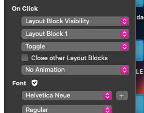
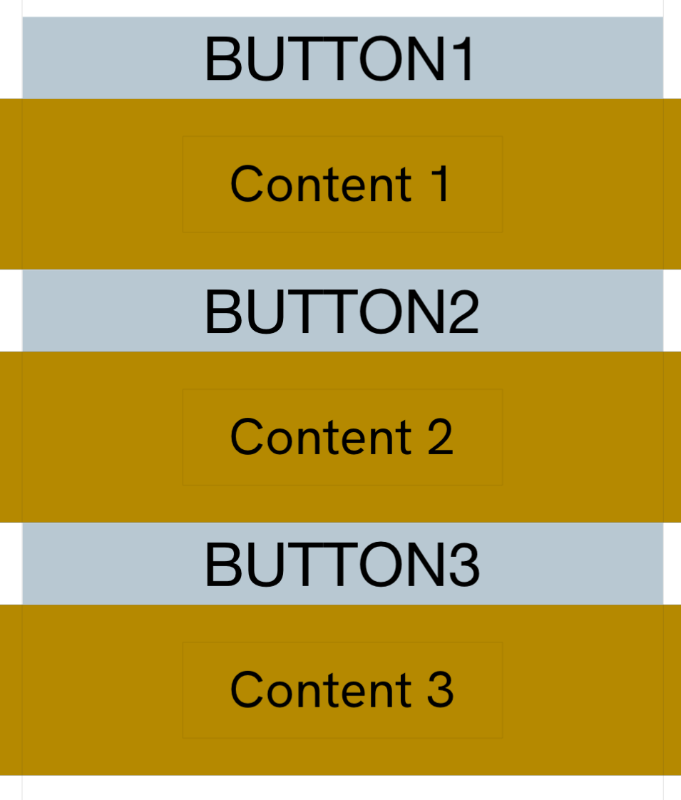
Then at the bottom of the page we are using a new (very requested) feature collapsible layout blocks for the versions.
Sparkle homepage
The hero animation was the most difficult one to make it right. We started using a video playing on scroll at first with the animation, but we ditched the idea because it didn’t look good.
So it consists on a lot of layers and carefully picked viewport percentages. It has also some one time animations like the scribble one (using reveal effect as well) or the appearing vector nodes. We have 4 sets of images, each one for each device width we used.
The video is just a popup that closes when the video finishes.
The paths that are drawn are Lottie animations that play on scroll.
The animations of the boxes were custom made and are mp4s playing on loop.
Then we reach the Sparkle window nightmare. We wanted to show the user interface in some way so we decided to explain the basic parts of the user interface. We first did a prototype that used the new snap scroll feature to have things entering the window to explain the parts but it didn’t work out well. So what we did is a stick to top on the window and then make the explaining graphics along the scrolling of the window also stick to top. On mobile we hide the animation and made a simplified version for better ux.
Then we have the creativity section. We used a Lottie for the creativity word effect, and then we displayed some of the effects that could be done easily in Sparkle: a block with a fixed background image and a block with the layers of the burger ingredients with scrolling animations to make the mid-air effect.
The made for you section are retouched svgs with text and the text clip effect to make the gradient on the “you” word.
The “one app” section was done with 4 images containing one puzzle piece in each one and with scroll animations.
The take a look button has a custom gif we did with an eye movement to make it more dynamic
And that’s all, you can check the rest of the website to see some other cool animations.
We had very little time to do this but we came up with some cool ideas I think. Maybe you can use some of them and make them yours.
Feel free to ask questions or share your thoughts, we did this for Sparkle but also for the community.
It was a pleasure to work alongside Duncan ![]()
Diego Pampín
relajao.es
international@relajao.es