Hello Again!
I’m over the moon that I have finally configured my site to be mobile friendly but there’s one problem that I can’t for the life of me find a solution for.
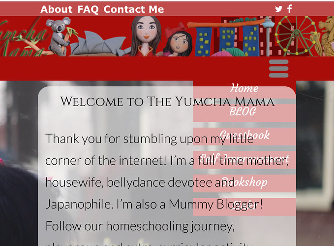
As you can see from the attached photo, the hamburger menu when expanded goes underneath the box and text box. I’ve tried bringing it forward etc to no avail.
Could someone please tell me how to solve this issue?
Many thanks!
@jazzbird, It might be easier if you click on you mobile hamburger and then check your Layers panel to the left and adjust it there to make sure it sits above everything else…
1 Like
Hello @FlaminFig! I did that to no avail. It’s become a complete mystery to me.
Did you group the hamburger with the red box? I would do that. Make the group a sticky menu and put it to the front (on top of all other elements).
Mr. F.
1 Like
Thank you! I’m about to sleep but will do it first thing. Sounds like it might do the trick.
It worked a treat! Thank you again @Mr_Fozzie!
