UI suggestion to prevent mistakes

This is a small detail, but it really bothers me that the collapse/expand arrow is so close to the 'discard all your work in this section" X mark. It is particularly terrible that if you mouse over them just so, they will move about, even appearing to switch places.

Why not move the C/E arrow to the left of the section words, and move the X to the far right, standing alone, where it is easy to avoid. Example:

> Section Header                         X
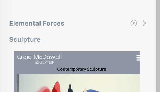
Screen Shot 2024-03-02 at 1.22.36 PM

Good idea! Hopefully that might come down the road in a future version.

This is a well known issue and it all derives from the relative low flexibility of the system component we use for the list of pages.

It should be noted that, unless you turn it off, by default clicking the (X) button will open a warning popup. While this is not ideal, it’s not as destructive as you make it sound.