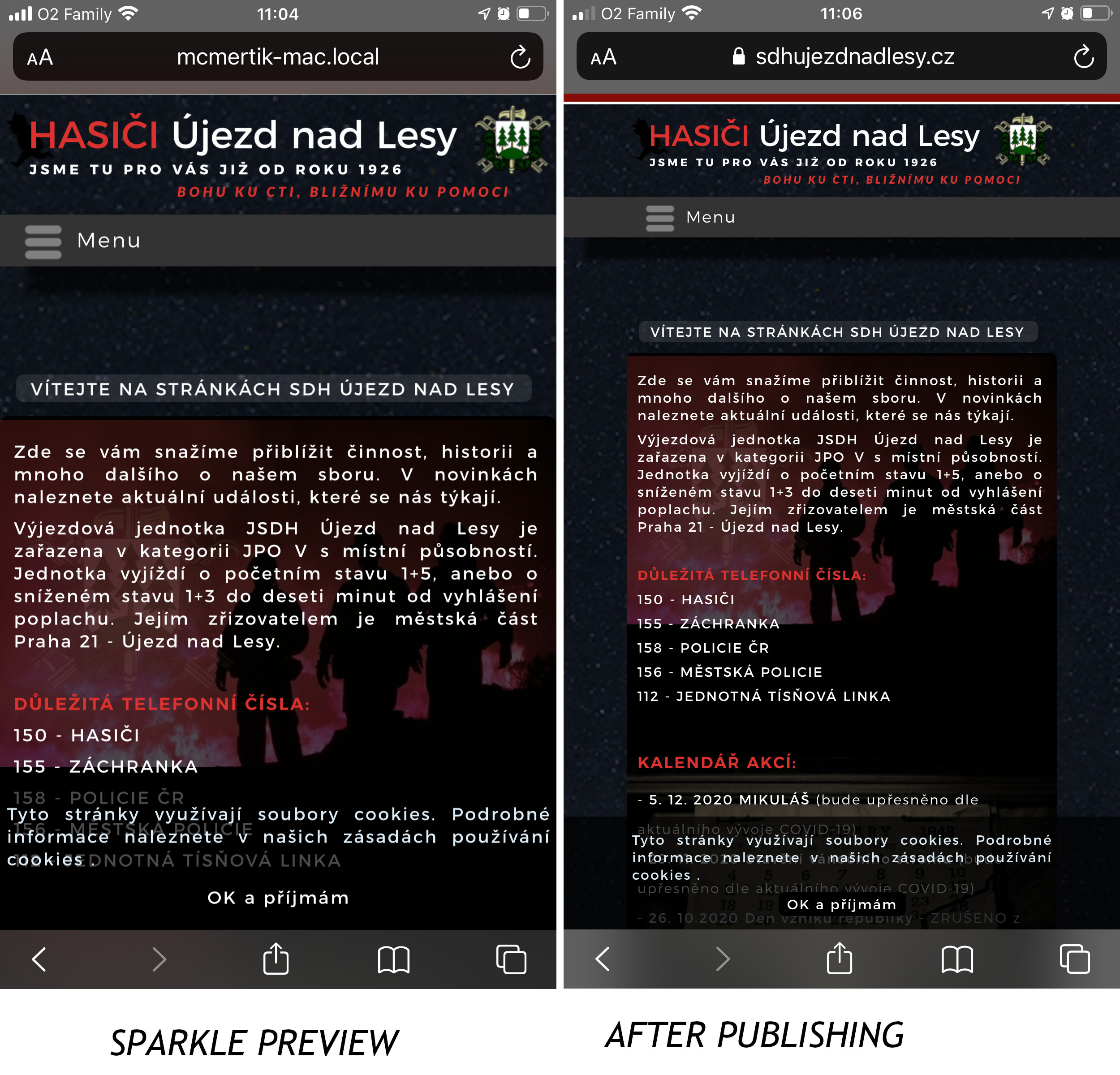
I have a problem with the ideal display of the website on my mobile phone after export. When I give a sample of the web in Sparkle, everything is displayed as it should in a web browser and it looks nice, but after exporting to FTP, large margins are created on the web page and all the content is reduced. De facto, it does on all devices that the content of the website is not from one edge of the screen to the other. However, every mm is known on the mobile phone.
@McMertik, If you view your mobile device in Preview as the “Current Device” then it looks like your first screenshot. If you change Preview to “View All Devices” then you will see what you have as the second screenshot in Preview which is what you see once you FTP your site.
The mobile’s device max width is 320 pixels so on a lager mobile screen device you’ll start seeing the left and right margins creeping in…
@McMertik, this looks correct. To see how it would look on mobile, use your mobile phone for previewing when designing in Sparkle, as suggested by @FlaminFig.