Hi everybody!
So after 5 days I was finally done with the mobile version of the website I’m working on. 
Checked everything a million times too… But still, after publishing it now I ran into something I can’t really understand.
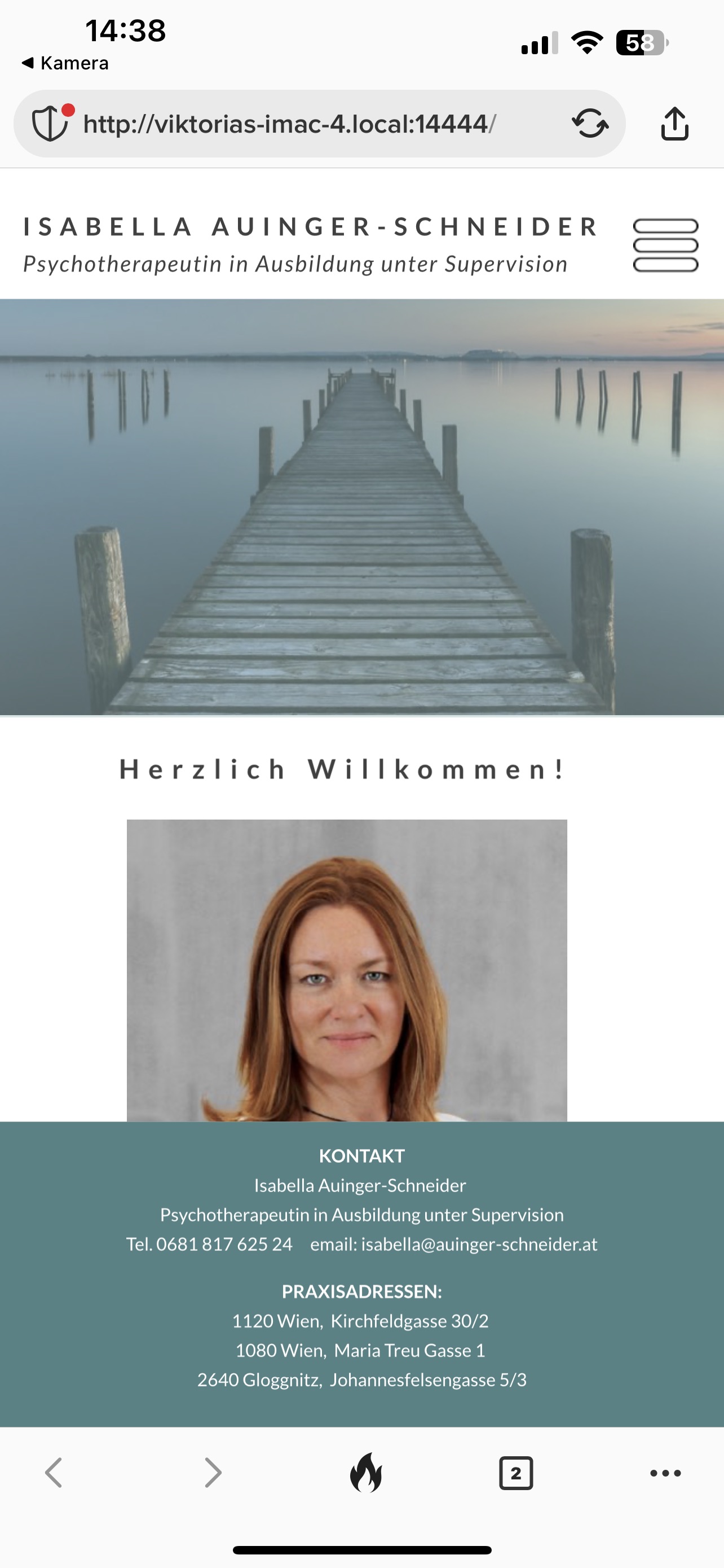
When I previewed the site on my phone it was the full width (aka all of the phone display was filled), but when I go to the published website on my phone, there is clearly not all of the space used, i have a gap to the right and to the left. I will enclose 2 pictures here to better understand. One is a screenshot of the preview version and one is a screenshot of the published version. Why are they different? Can anybody help me figure it out please? As I see it in sparkle you only have a designated area to work within, you can’t go outside those lines left and right…
OH AND SOMETHING ELSE: the Sticky header is not sticking to the top in the published version  . No idea why…
Hope its understandable, english is not my first language.
Could it be @Dooria79 that you are Preview(ing) mobile that you have Preview Feature / Current Device instead of Preview Feature / All Devices?
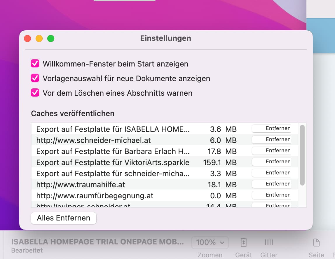
To get around it you could go to Settings / Miscellaneous / Mobile Auto-Scaling and then re-Publish your website overwriting what you have on the server.
Weird I can’t find that second path you described under the sparkle settings 
I have a mobile version that looks different from the pc version- will that “all devices” (if I ever find it) mix that separation up? because i wouldn’t want to have to do it all over again 
It can’t be related to my own phone specifically- i just tried it on a Samsung I had lying around, same problem… (i have an iPhone personally)
Hello.
No offense - but (good lord) what did you do there?
For the PC version you have 5 pages with the different contents. You should keep that for the mobile version too! Otherwise you have to hide content per device or make it visible. And that leads to a very unattractive layout.
Open your live page on a Mac and switch to the view “Responsive Mode” with control+command+R. Then a bar with various devices should appear, through which you can click once to see how it (possibly) looks on such a device.
Honestly: it looks really bad in parts.
My advice: leave it at the 5 pages and adjust them accordingly for the smartphone. Then we’ll see further.
Mr. F.
Thank you for your opinion.
No offence but
I happen to like the design as it is, and the 2 different structures too.PLUS the person who it is for loves it. The only thing i could imagine is doing a onepager for pc too. But surely not the other way around.
Any suggestions on the original problem and how to fix the with-problem? Bc the way it is published yes it looks shit bc of the white frame that isn’t supposed to be there…
Ok.
You have to decide how the layout will be in the end.
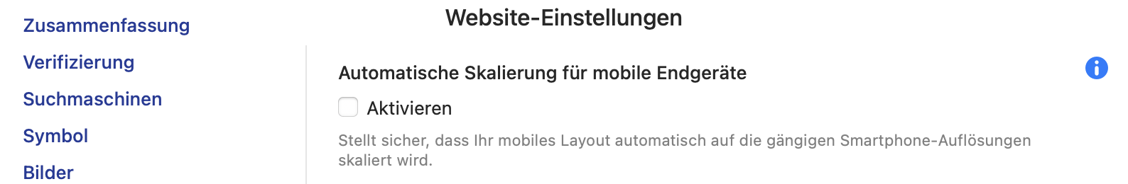
What FlamingFig meant is here: Open the settings for the project - cogwheel (Zahnrad) on the top right - then select the second to last entry “Miscellaneous” = Verschiedenes:
Mr. F.
1 Like