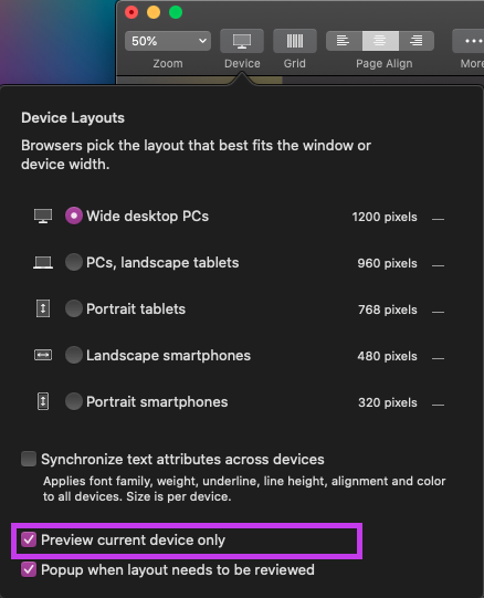
It’s probably old news to most veteran Sparkle users, but something that might help the newcomers. If you have ever thought to yourself “what does this box do?” (As per the screenshot) I’m here to answer it, now this box might be confusing to the new Sparkle user when left ticked. The issue you might have when ticked is that when you preview your site it will not scale as per your breakpoint (not sure if I’m using the term correctly but @FlaminFig will help me out  ), so stretching from a Wide preview to a standard desktop preview or even a tablet mode preview might leave you wondering why your content isn’t scaling is because your browser is previewing the option you’ve selected, so if you are working on your mobile layout and that box is ticked previewing the site in your browser will render it as if you are using a mobile phone to view the site. I find this box handy because it does allow me to test each view per device in a browser window. I do hope this makes sense as I tried to explain it the best way I know how. I hope this does help some of the users who either have wondered why the preview doesn’t scale or for people who want to test different devices in a browser…
Great reminder. And a little more in the documentation.
Well done @Anti0606! 
So whichever device you have open in the Sparkle canvas you will see with “Preview current device only” ticked. I nice trick I use with it not ticked and all my devices (mobile, tablet, laptop, and desktop) connected I can see a change I make across all 4 devices simultaneously… nifty!!!
What does this mean?
Does it mean I have to adjust the side for every device by hand?
Why the yellow triangles if it is automatically adjusted?
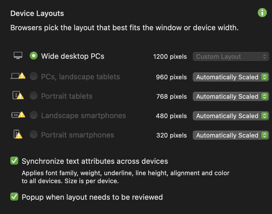
@Swedutch, It means that after you created your other devices you must have made changes on your 1200px layout which has affected all the other devices. So the warning triangle is alerting you to go in and adjust for the changes you made on the 1200px.
I think Users are thinking they don’t have to do anymore work for the other devices by selecting “Automatically Scale”. If I finished creating my 1200px I would then Custom layout my 768 and then Custom Layout my 320. If I want to introduce the 960 and 480 then i would use “Automatically Scale”.
Thank you for your answer.
Will make my adjustments.