I’m not really sure what the W3C says about this, WHATWG is the working group for HTML5, but regardless I think you are overthinking it.
There’s no consideration about something appearing “too small”, that’s an intrinsic property of the device, meaning the whole arm’s length reasoning is part of the design of the device and screen size. For example Apple’s desktop screens are consistently in the 110 dpi or 220 dpi ranges, respectively for non-retina and retina. Apple’s mobile screens are in the 163 dpi, 326 dpi or 400+ dpi ranges for non retina, retina and super retina/liquid retina.
From the web page point of view there are just screen points (not to be confused with text measurement units, which are pretty messy). Each screen point is a single pixel on a non retina screen, or 2x2 pixels on a retina/hi-dpi screen.
There are various techniques to send the images to the device to get best performance, compatibility and quality/crispness. Sparkle takes care of generating the images at the best compression ratio, at the optimal size and with the proper “responsive image” setup in HTML, CSS and JS. It is a pretty complex topic and spans progressive enhancement, accessibility, compression and page load performance matters. We have put a tremendous amount of energy into making this work right, and while there is some wiggle room for improvement we’re very happy with the current setup.
From the Sparkle user point of view there’s one metric for handing Sparkle the correct image, for the time being only visible in the image element settings. We hope to add it in the box background image settings as well.
That’s the “resolution meter”, which tells you how much leeway you have, for example here I dropped a relatively small image on the canvas, the image settings says this:
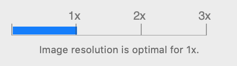
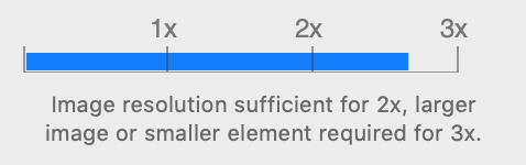
this means the image won’t really be very good in 2x. Though if I make the image frame smaller in the canvas, the resolution meter will go up, you can actually see the resolution meter move as you resize the image frame in the canvas:
Here I dropped a huge image on the canvas:
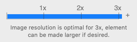
What this means is the image will always be a good source for generated images of any size (at the current canvas frame size).
So the conclusion of all this is:
- by dropping a pretty large image in the canvas I have the flexibility to resize it freely, so it’s generally best not to export artwork from a design app at the exact final size
- the above is even more true if you consider that if you design in a multi-device setup, at the 960 device size the frame will have one size, but at the 1200 device size the frame will be larger, so you need “more pixels” from the source image
- if you drop the biggest and largest image size you have, maybe too large for even the 3x density on the largest device, that larger image will be part of the Sparkle file and will make it bulkier… this adds up, so not a problem for an average project, but maybe something to think about if you have an image heavy and large project file
Full width images on box backgrounds need slightly more consideration because as mentioned Sparkle doesn’t yet show the resolution meter for those, and by stretching the image you need a little more source material. @FlaminFig’s suggestion of 4400px is good if maybe slightly over what Sparkle will generate, but having the source image be higher res is good.
Finally, it’s generally unnecessary to have Sparkle generate 3x images, the perceived quality improvement is usually very minor.