Very nice!
One of the food photos was a bit gray, so I ran it through Photoshop.
See if you like the difference.
Dave

Made With Sparkle. Thank you Duncan and all others working on the app.
Antoine
WOW @JDHamsterWheel, you have totally floored me!
I did not know Star Trek was so extensive - I’ve only seen the tip of the ices-berg and I love Star Trek!!! 
Finally, got the “big” site published. The mobile side is not created “properly” but it’s a workaround required for now.
Many thanks to all who helped. Looking forward to V3.
I LOVE your button dripping honey! Also, the honeycomb transition is brilliant!
@kaitiaki Hi nice website. I would change something on dhorspool.com.
When I open your website I see the picture as a frame
You could tackle that to make a wide box with the picture in it. Would look so much nicer.
Hope you do not mind.
Thanks.
I am using graphic software (Affinity Designer) with Sparkle.
I copy the hexagons from Affinity and paste them into Sparkle.
@macarna I thought you made them in photoshop or something.
Is it a template?
I made a bee website for someone (www.delachendebijenkast.be) and thought it would be nice to exchange my round photos for hexagons. If you do not mind of course!
Loved the idea!
I have been using the Affinity suite instead of Adobe apps for 4 years.
It is more useful and its licenses are much more convenient.
No, it’s not a template. I designed it.
Of course, you can use.
Thanks.
I thought you wanted to use hexagons. I guess I got it wrong.
Do you want to use my design?
Yes, something like that.
I made a couple of websites.
One is very simple like this: https://www.joosten.se
and one with more information http://www.delachendebijenkast.be
I am sorry to say. Your home page does (in my eyes) not match the rest of it, if you know what I mean.
I hope you do not mind. I do not want to be rude. It is also a good idea to have your pictures the same size. You can do that in Sparkle by making the picture fit in the area.
Neither am I a professional. I hear thought that I am good at making websites.
Maybe you can adjust this template: https://sparkleapp.com/designs/designs/garnerphotography/
This template is especially for photography.
Good luck and have fun.
Annuska
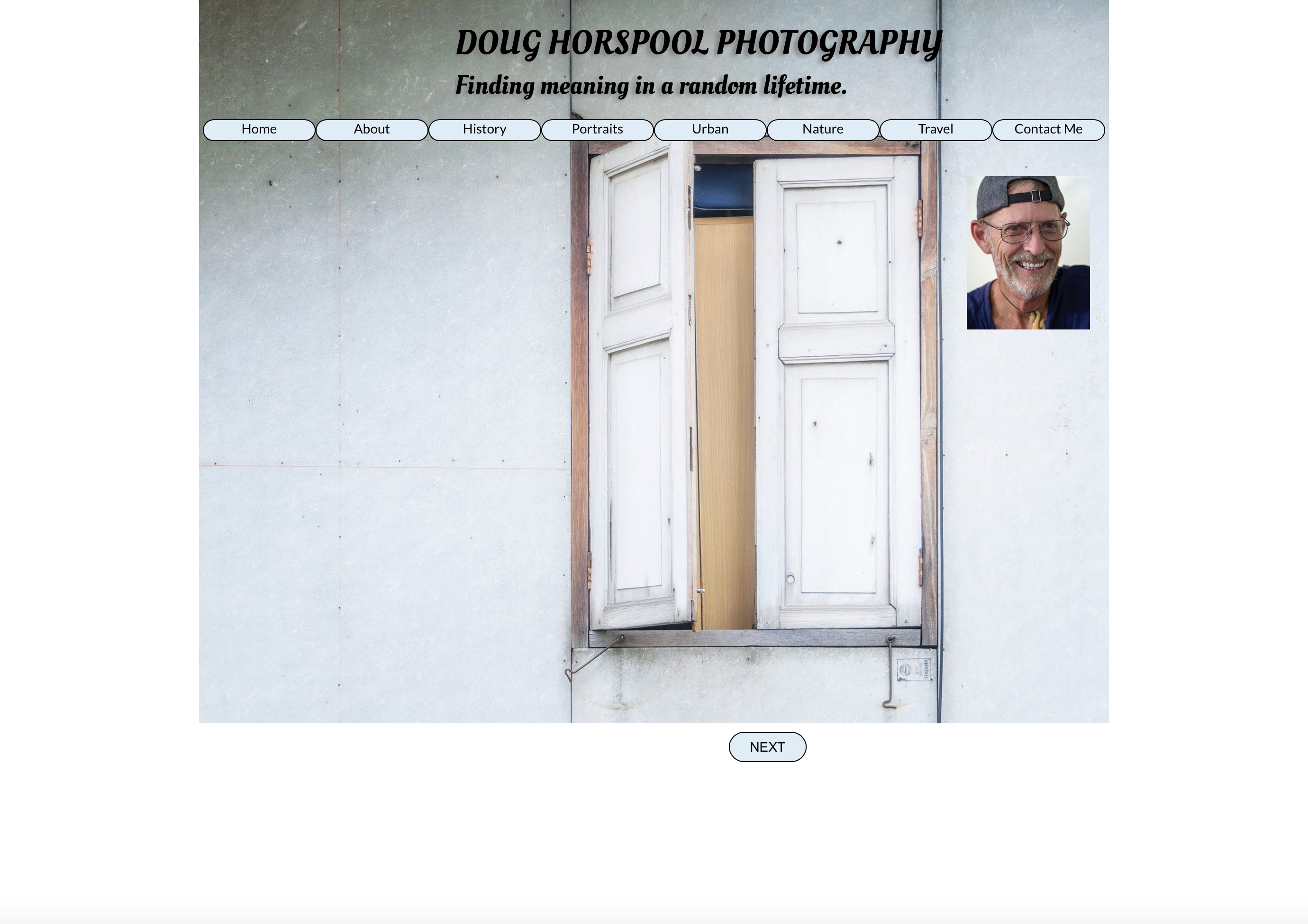
OK, I see what you mean. I have made several tweaks that I think improve the design. I took the splash photo on the cover page off the title and used a shadow to create a frame. I also put a textured background on all pages to make them look more alike (especially the home page).
I made all photos the same size using “fit” and rounded them with shadows. I think the design of that looks better.
If you would, I’d appreciate you taking another look and tell me what you think.
Thank you so much for your critique! You were observant and kind, and you’ve helped me improve my design considerably.
Cheers!
Doug
Hi Doug,
That looks so much better.
And as an introduction you could put your about on the first page.
Would be nice with a bit of text on the front page.
A job wel done!
Cheers to you too!
Annuska