Everything in the published page is bigger than in the preview, and so text and images are too big. I found this issue discussed here
which explains why this can happen, but I am not sure how to fix it. My desktop PC device size is set to 1200 pixels, and I am looking at the images in Safari on a 1920 x 1200 monitor. The preview and published pages are in tabs in the browser, so they should be the same size, but they are not. This problem does not seem to show up in Chrome. What I should I change (or have done differently) to have an accurate preview? Thanks.
So let’s talk Device settings…
How many devices have you created and are any “automatically-scaled”?
If you have more than one Device created what have you got for your Preview settings?
If you have “Current device” selected when you have more than one Device created then what you see in preview will be different once Published.
For me anything above 1200 wide and it becomes a mess when reading blocks of text. Also if you have the 1920 auto-scaled then it is presented as a billboard size up close on a 27" Mac! Very visually off putting!
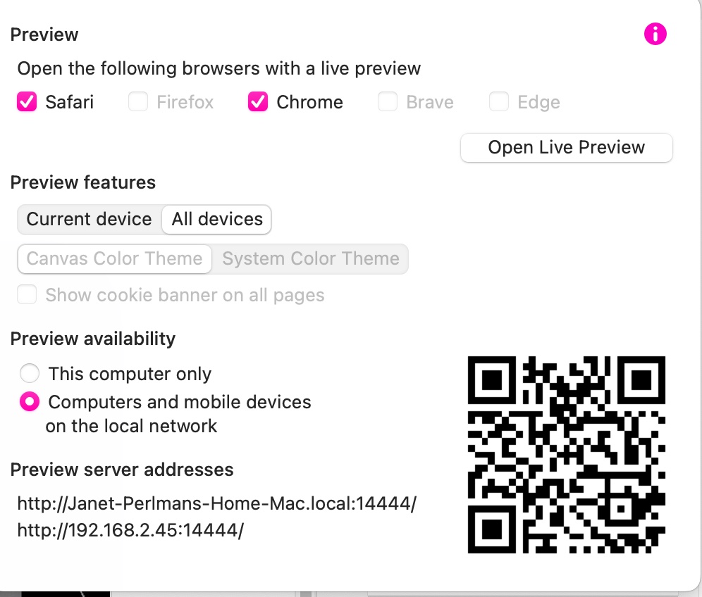
I have customized for desktop PC and portrait smartphones, and the rest are automatically scaled. I preview all devices. I’m not sure I understand why it should be inaccurate in Safari, but not in Chrome. I use Safari normally, but I can’t seem to check Safari only. That is not an available option. I guess if I had compared preview in Safari and Chrome, I might have noticed the difference. But what to do about it? Change sizes and do a compromise between the two?
How very strange. The problem is gone! I was publishing to a staging site. Now I just published to my site and it looks the same. I don’t know why that happened. Thank you for the help.